
Adobe Photoshop
Adobe Illustrator
Mixed media
2025
Adobe Illustrator
Mixed media
2025
Objective
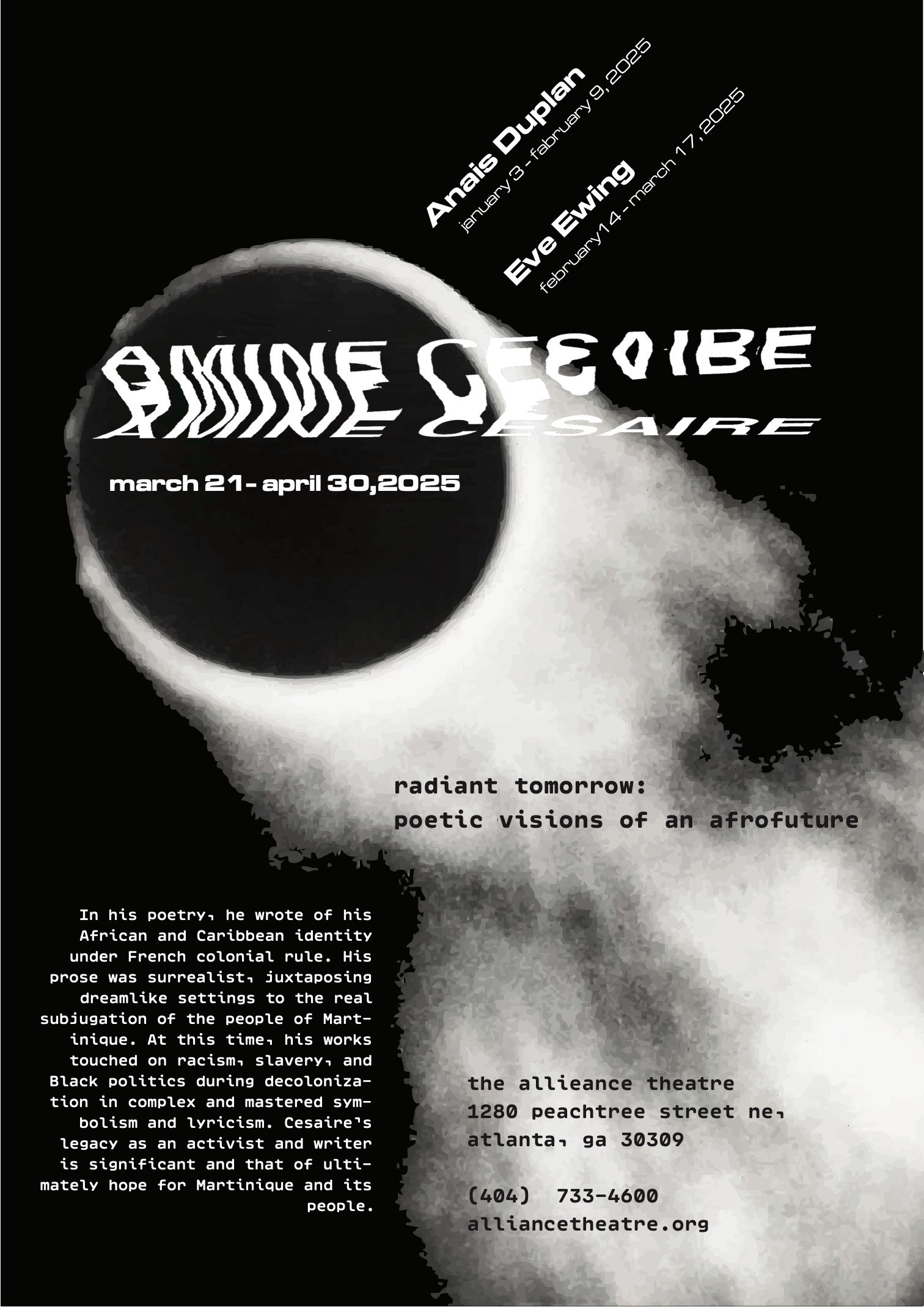
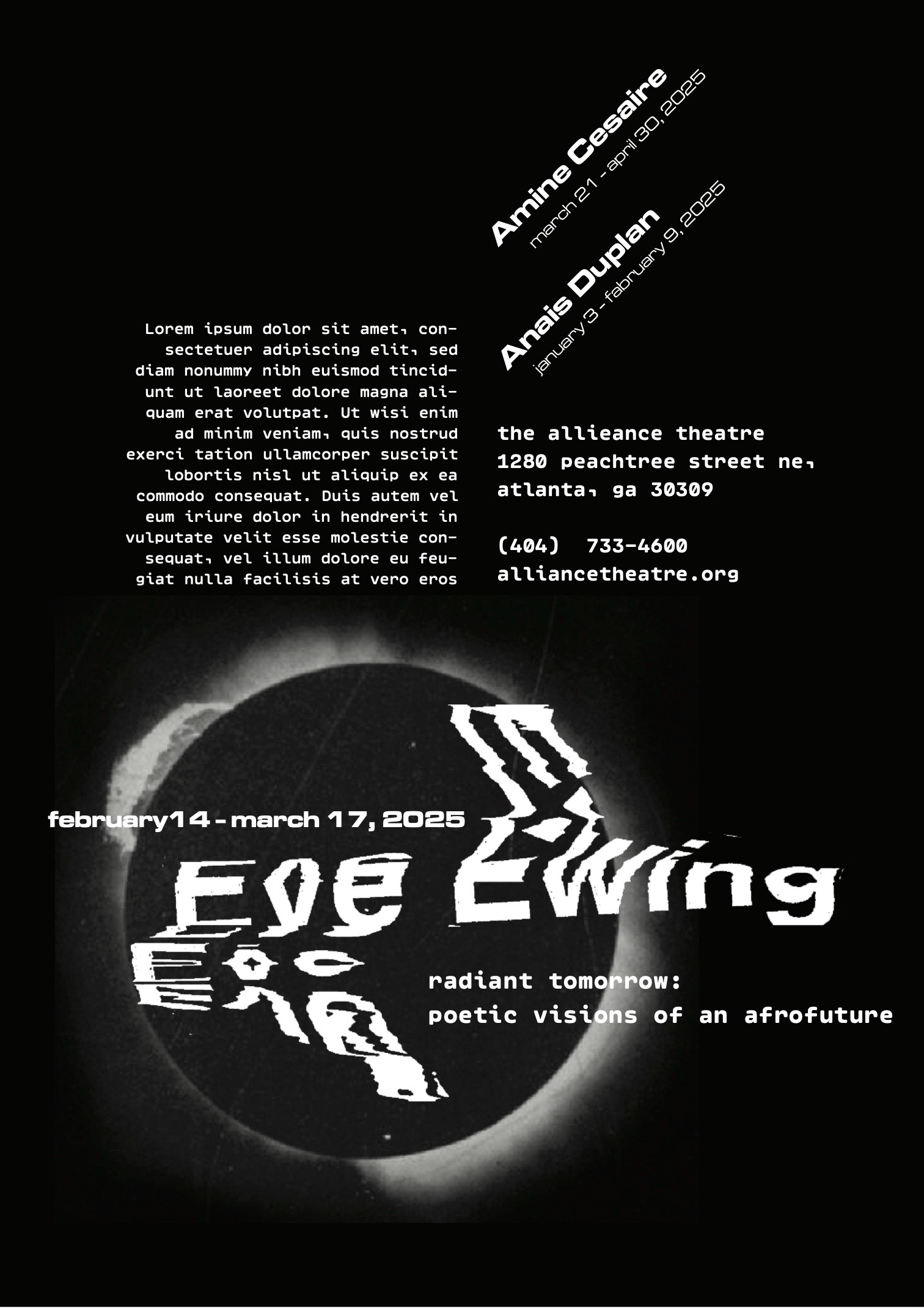
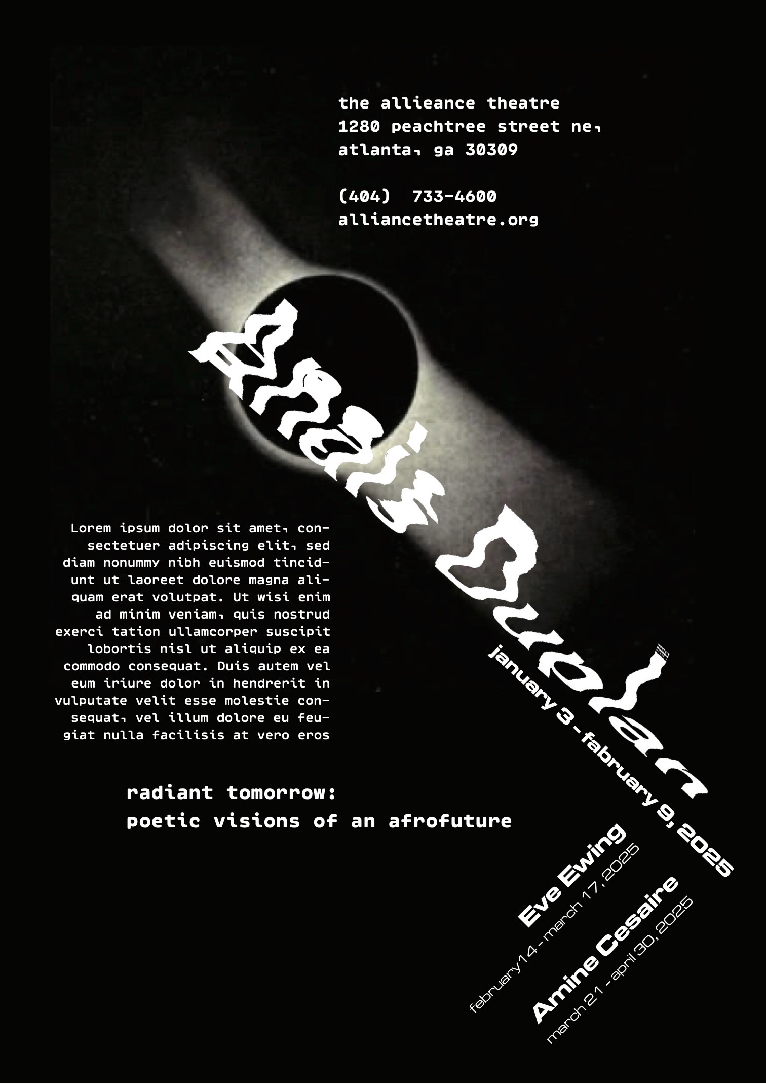
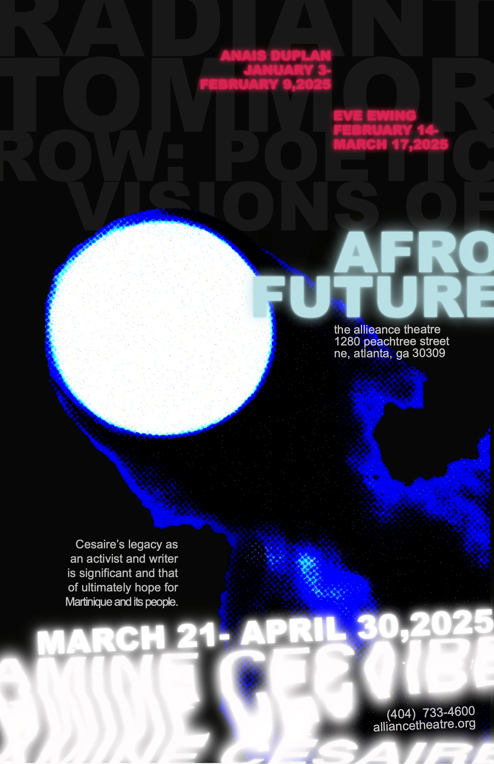
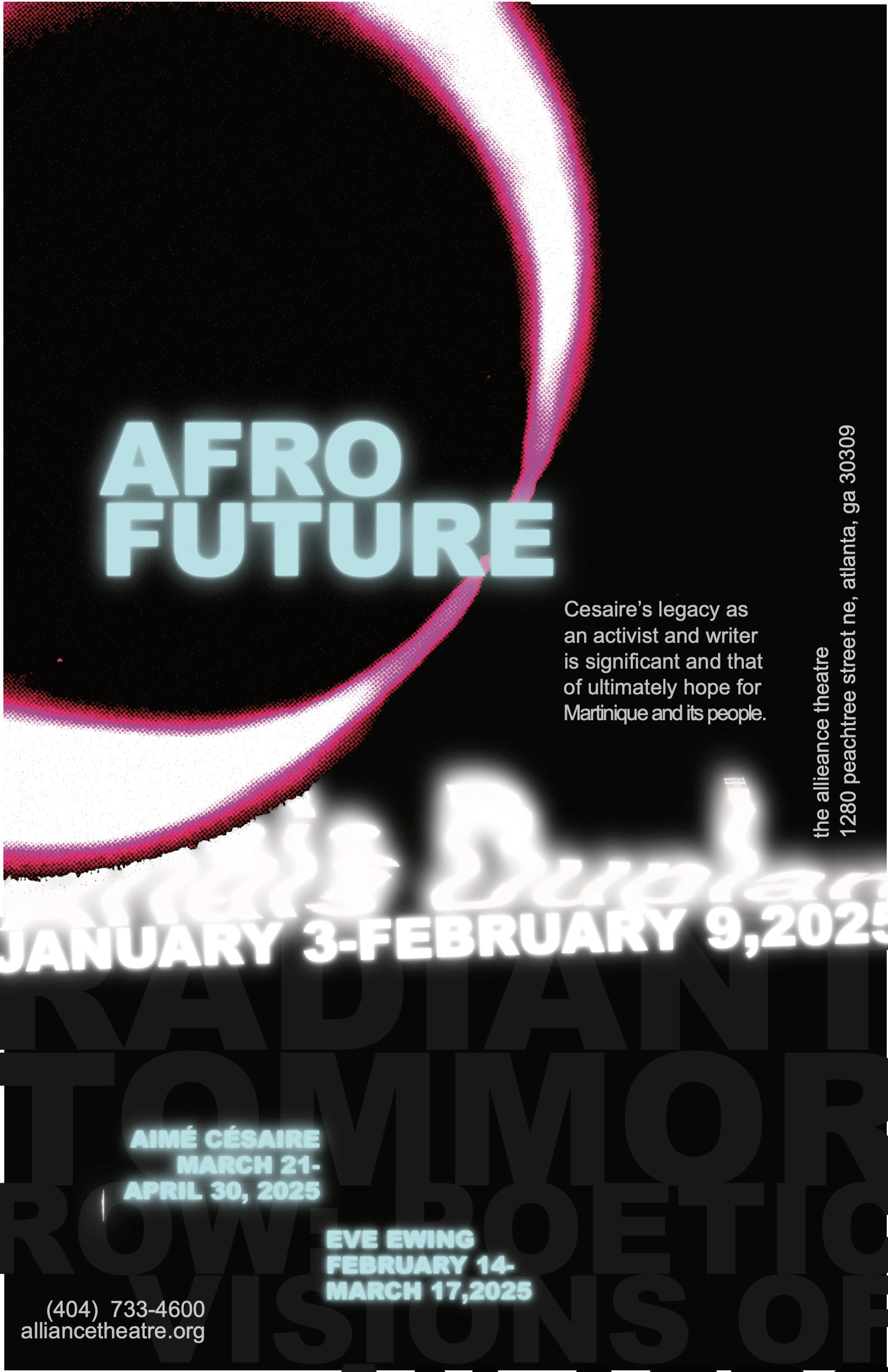
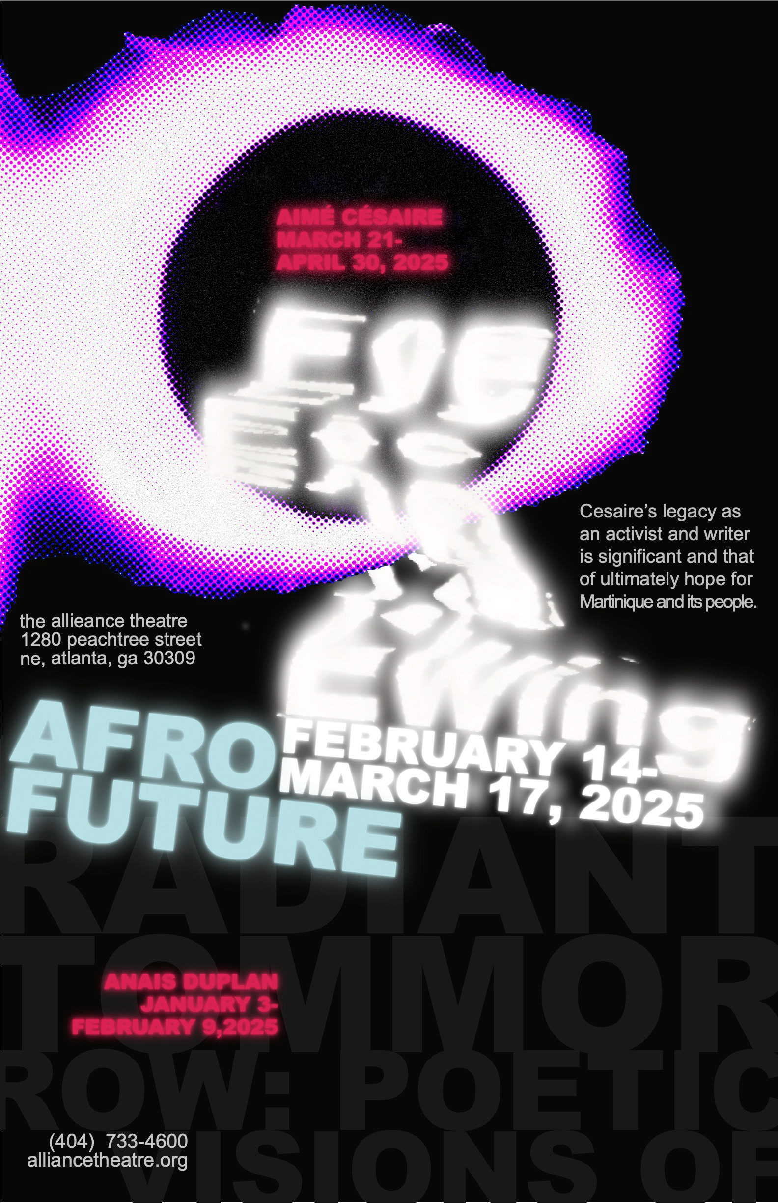
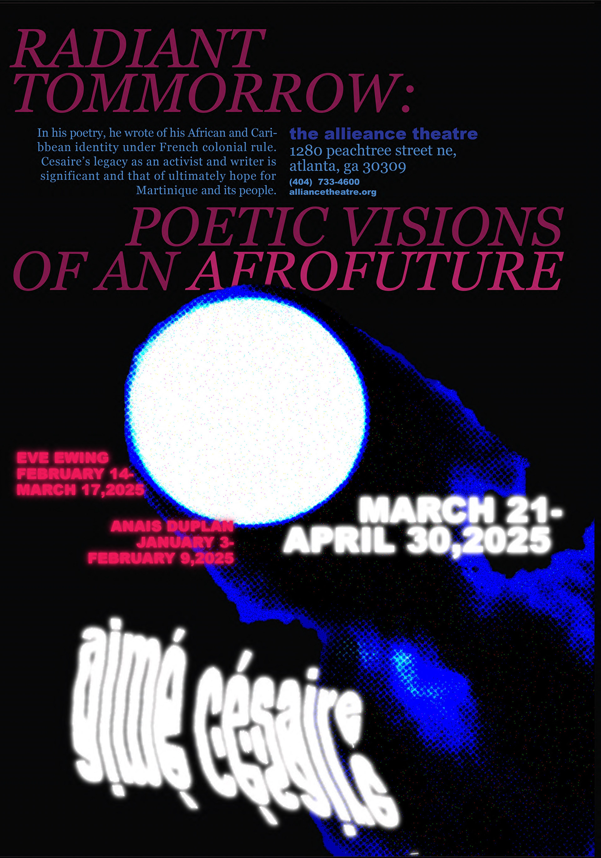
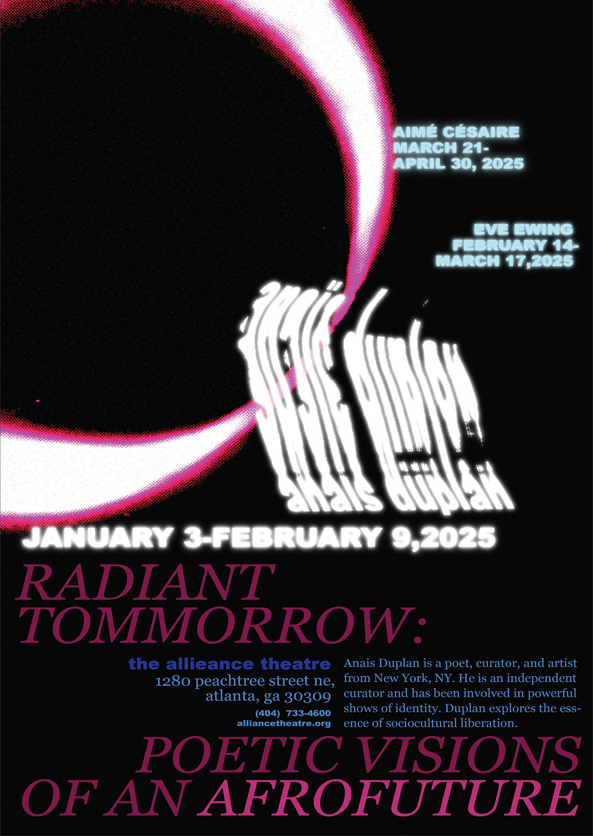
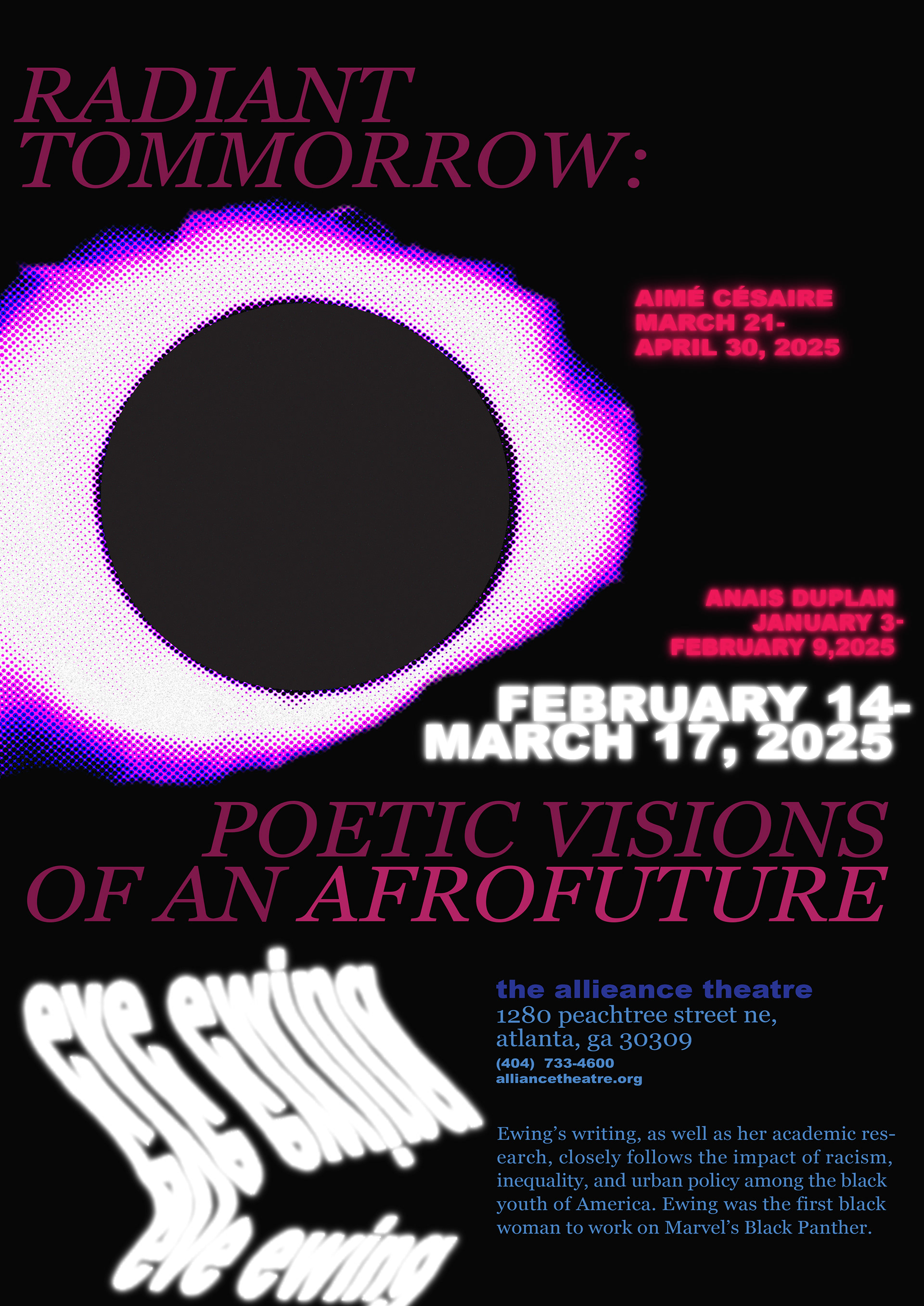
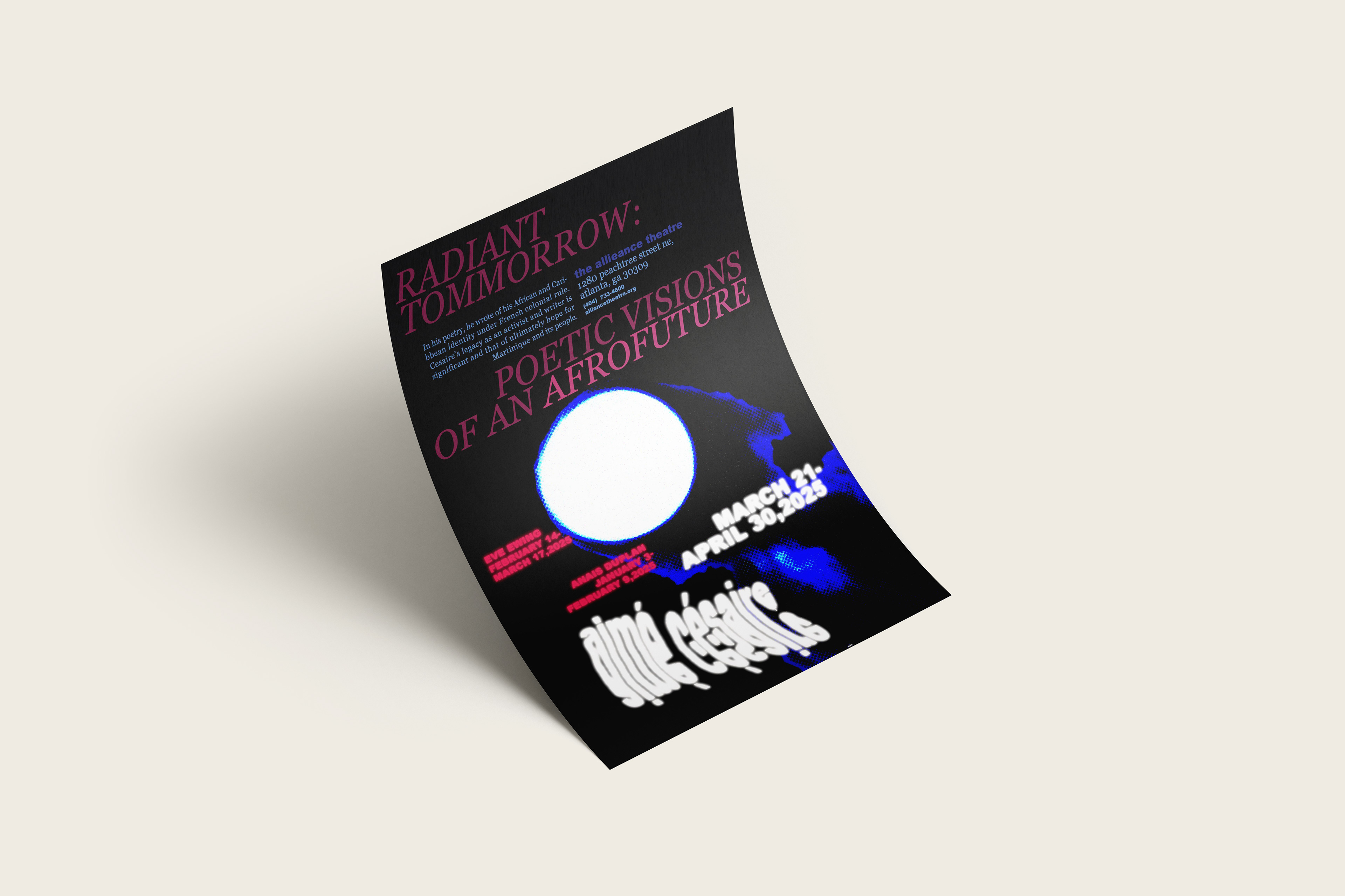
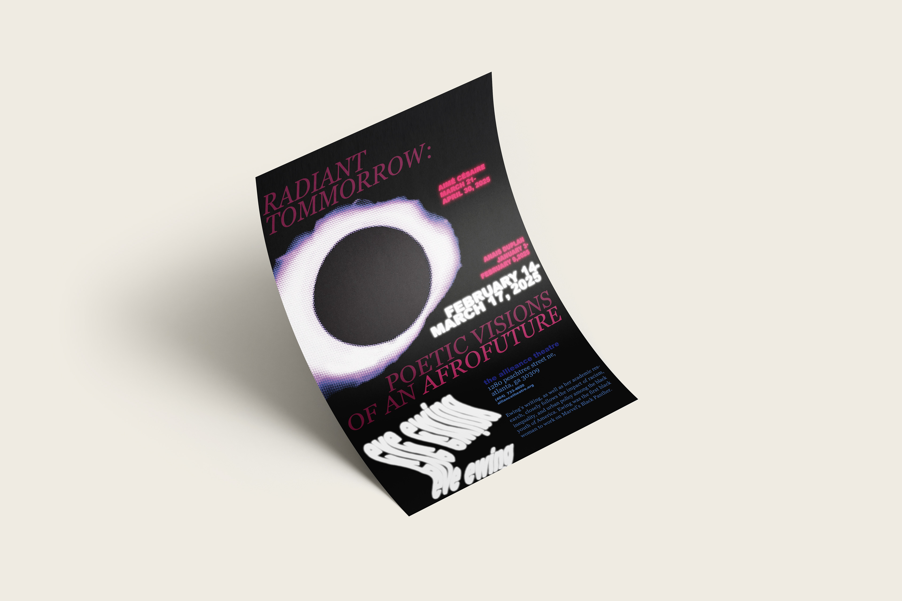
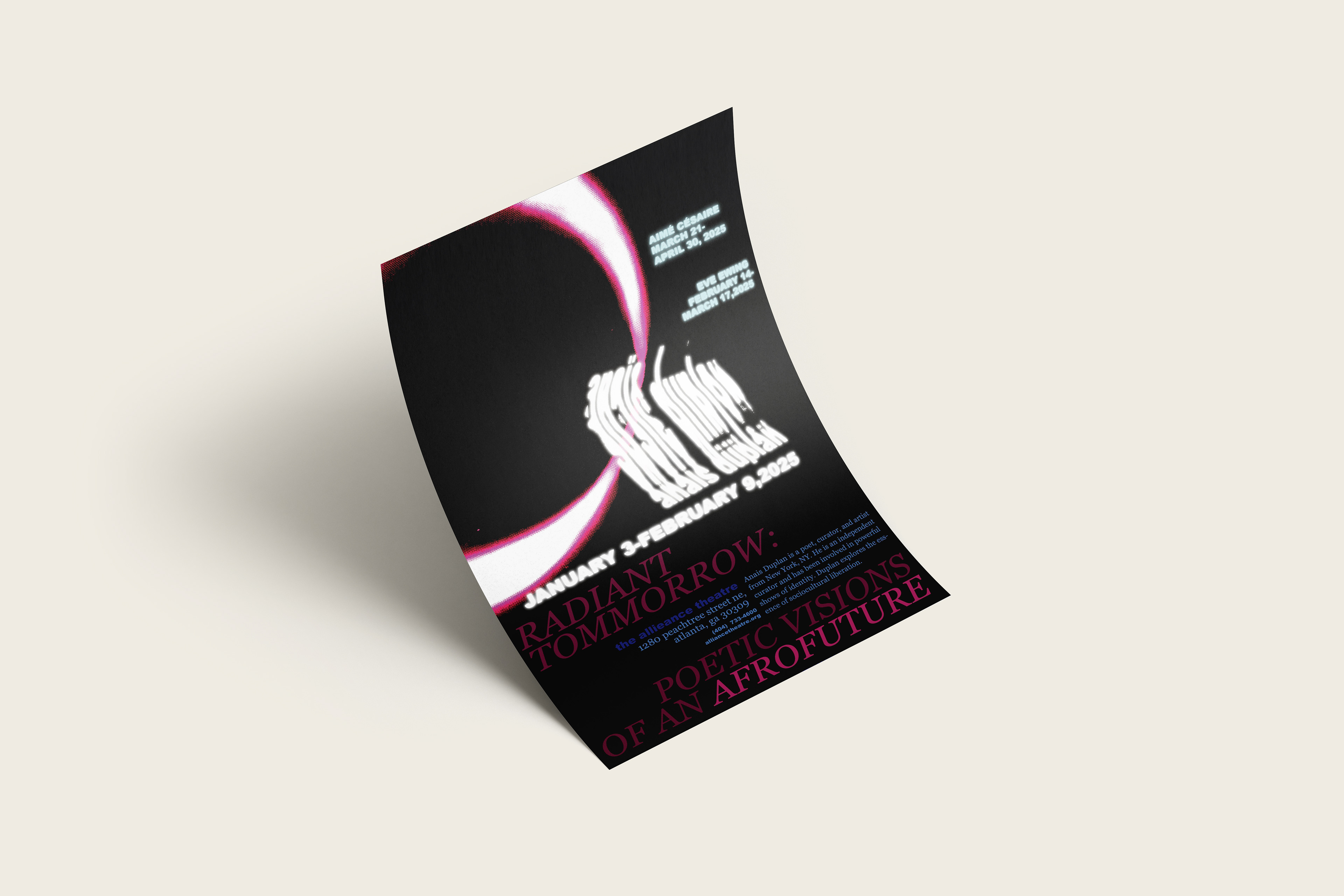
Develop a series of dynamic and visually interesting posters for three influential poets. Incorporate analogue type and imagery, supporting thoughtful and relevant concept. The theme of the event was, “Radiant Tomorrow: Poetic Visions of an Afrofuture”; I decided to use cosmic events as visual representation, as they can represent change, new beginnings, and the passage of time.
Develop a series of dynamic and visually interesting posters for three influential poets. Incorporate analogue type and imagery, supporting thoughtful and relevant concept. The theme of the event was, “Radiant Tomorrow: Poetic Visions of an Afrofuture”; I decided to use cosmic events as visual representation, as they can represent change, new beginnings, and the passage of time.
Knowing the poets

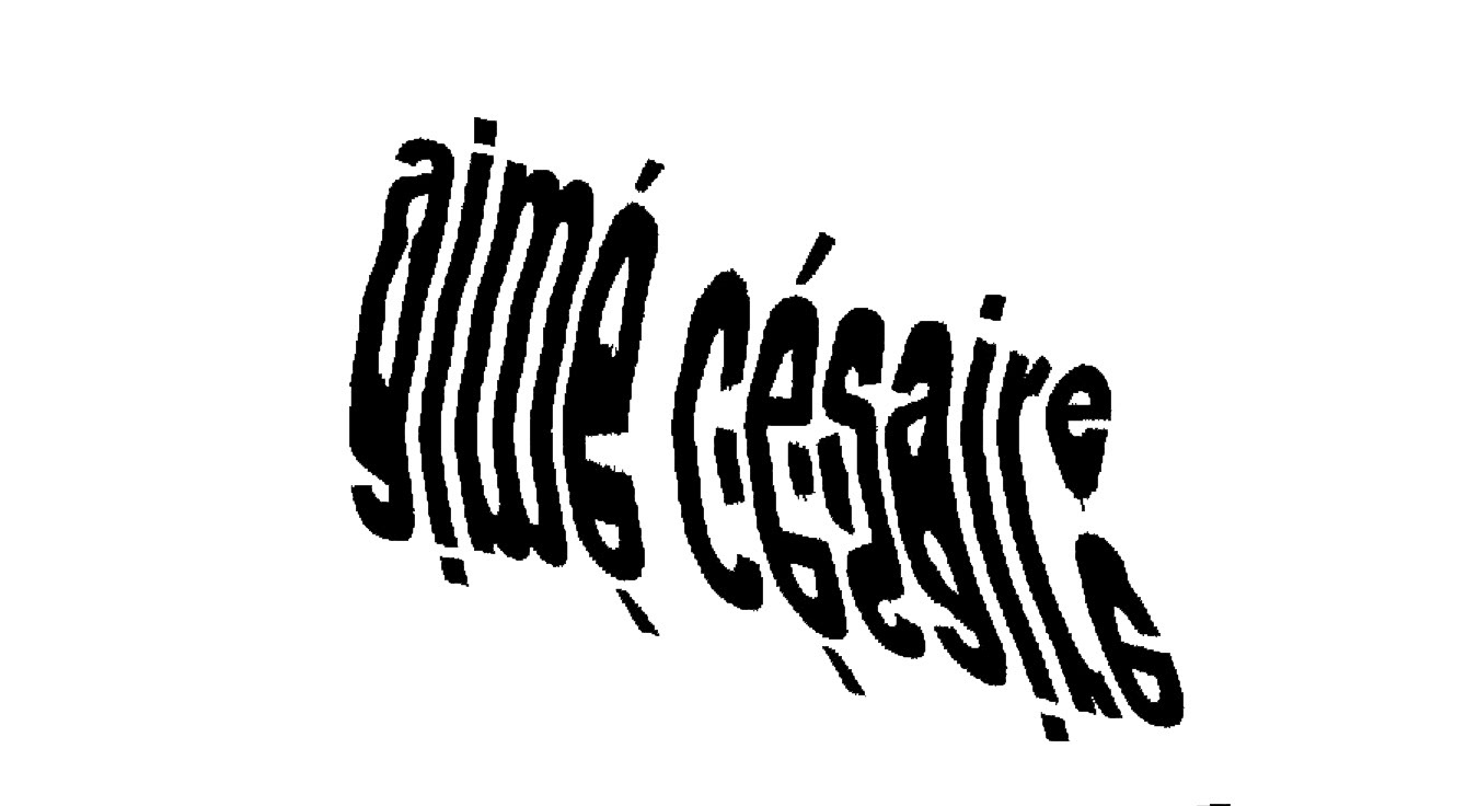
Amie Cesare was a prominent Martinican poet and playwright from the 20th century. His works dealt with theme of racism, slavery, and Black politics during decolonization in complex and mastered symbolism and lyricism.
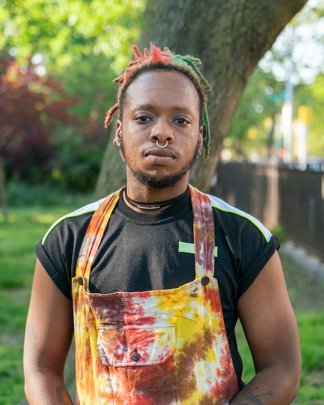
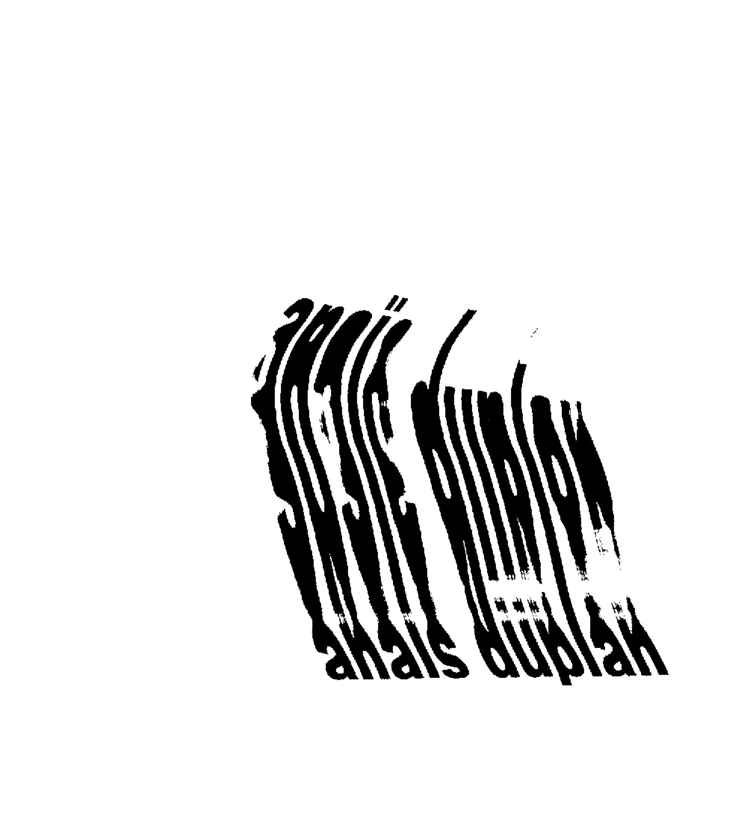
Anais Duplan is a poet, curator, and artist from New York, NY. He has been involved in powerful shows of identity, including “Black Secrets” and “Paradigms for Liberation”. Duplan explores the essense of sociocultural liberation.
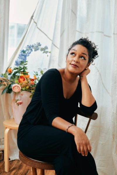
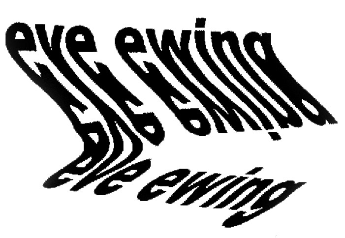
Eve Ewing, born in the late 20th century, is a sociologist, poet, and visual artist from Chicago, Illinois. Ewing’s writing, as well as her academic research, closely follows the impact of racism, inequality, and urban policy among the black youth of America.
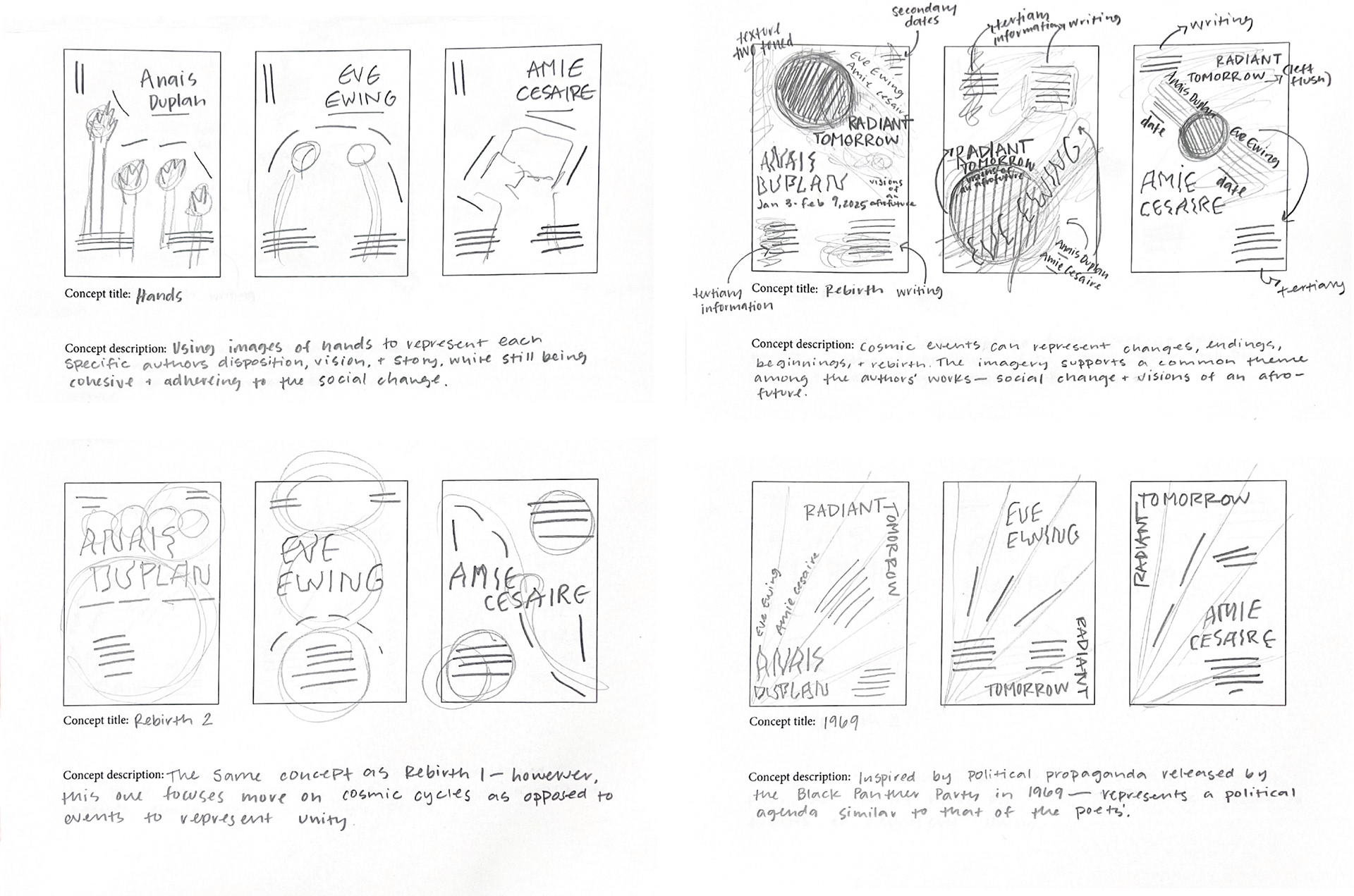
Early Sketches and Ideation
After researching the poets, I settled on 'Rebirth' as a concept route, introducing cosmic themes into the posters. To me, the common theme among the poets' work was their deep contemplation of the Black experience, and their hope for social, political, and cultural change. Cosmic events commonly represent changes, endings, beginnings, rebirth, and also the passage of time. I found this narrative to be fitting of the poets' personal philosophies, as well as support the notion of afrofuturism.
After researching the poets, I settled on 'Rebirth' as a concept route, introducing cosmic themes into the posters. To me, the common theme among the poets' work was their deep contemplation of the Black experience, and their hope for social, political, and cultural change. Cosmic events commonly represent changes, endings, beginnings, rebirth, and also the passage of time. I found this narrative to be fitting of the poets' personal philosophies, as well as support the notion of afrofuturism.
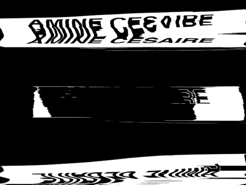
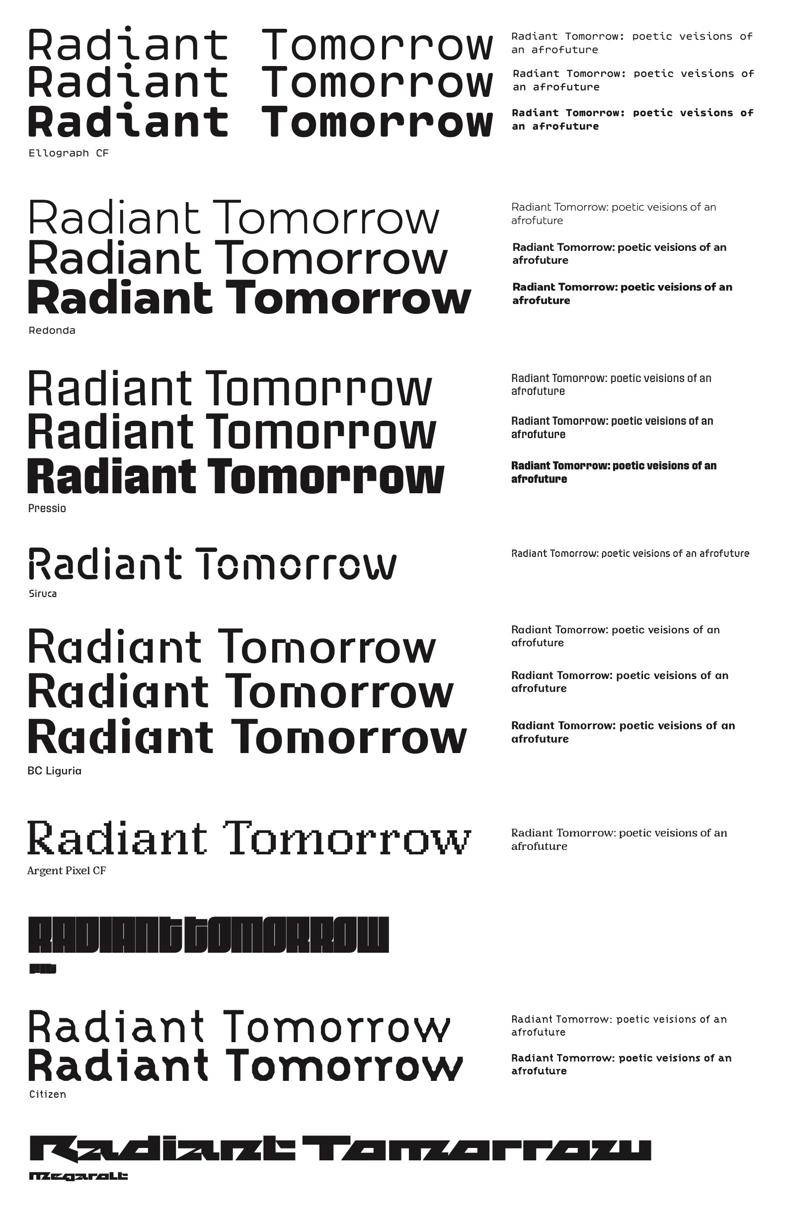
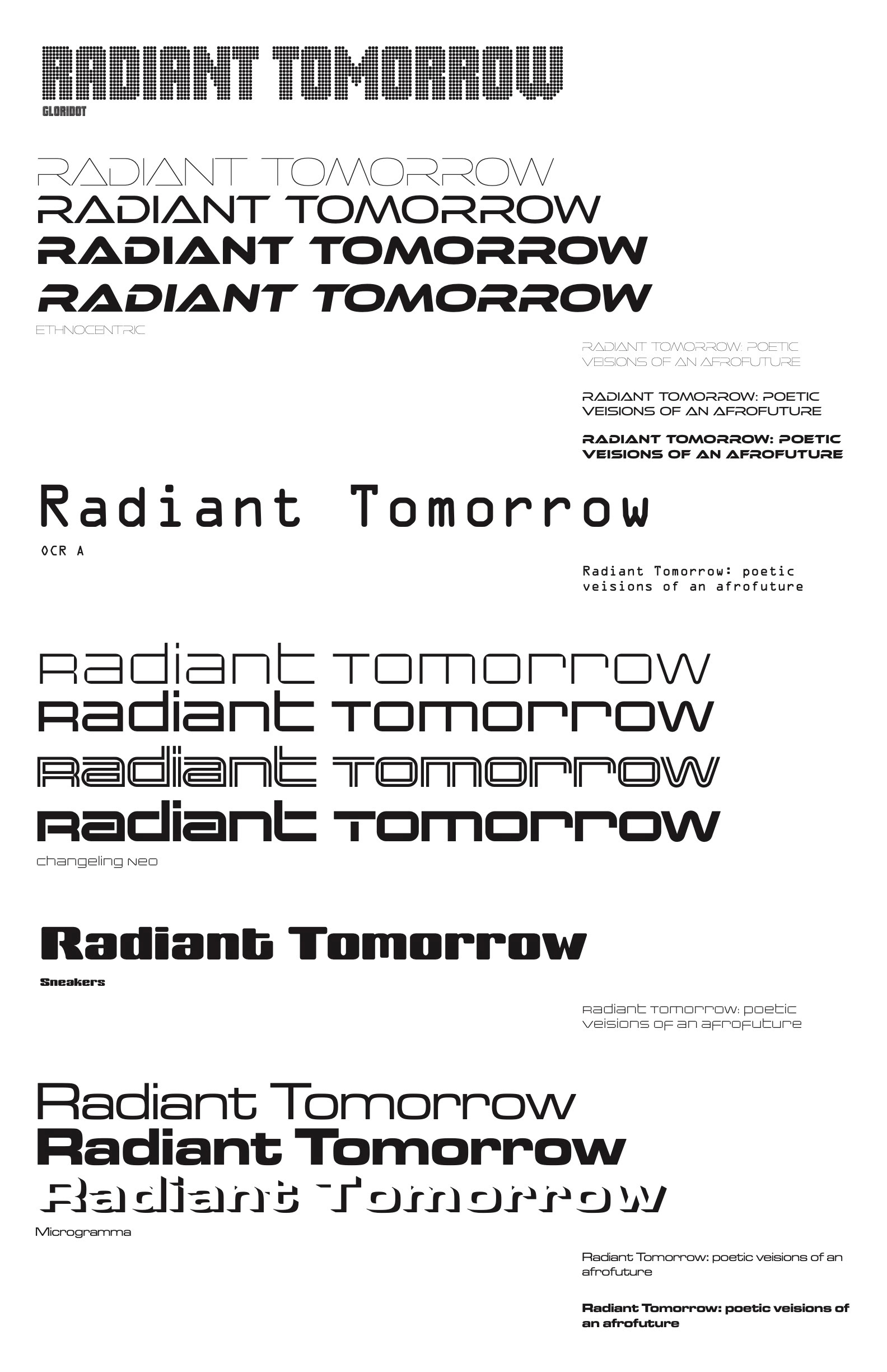
As the parameters of the project required the use of analogue type and the incorporation of mixed media, I decided to explore manipulating type with a printer scanner. This process was an exploration of distorting type while also attempting to keep enough of the letterform's integrity to remain legible.
Type & Color
I decided to go with an analogous color palette in order to give the posters a related feel, while maintaining some contrast. Additionally, all of the colors chosen are saturated enough to contrast from the black background of the posters, maintaining the letterforms' legibility. The selection of Arial Black and Georgia as typefaces was also with a contrasting, yet harmonic, intention. The heavy weight of sans serif Arial Black next to Georgia, a more traditional serif typeface, creates distinction between the two and aided in establishing typographic hierarchy.
I decided to go with an analogous color palette in order to give the posters a related feel, while maintaining some contrast. Additionally, all of the colors chosen are saturated enough to contrast from the black background of the posters, maintaining the letterforms' legibility. The selection of Arial Black and Georgia as typefaces was also with a contrasting, yet harmonic, intention. The heavy weight of sans serif Arial Black next to Georgia, a more traditional serif typeface, creates distinction between the two and aided in establishing typographic hierarchy.

Digital Exploration
I ended with three iterations of the 'Rebirth' concept, shown below. Through type and color studies, I experimented with color and greyscale, and a variety of typefaces. I explored several concepts that I did not develop further into iterations, but learned more and more from each experiment. Shown directly below are two iterations brought to completion, and lastly, the final posters.
I ended with three iterations of the 'Rebirth' concept, shown below. Through type and color studies, I experimented with color and greyscale, and a variety of typefaces. I explored several concepts that I did not develop further into iterations, but learned more and more from each experiment. Shown directly below are two iterations brought to completion, and lastly, the final posters.