

Adobe Illustrator
Adobe Photoshop
2025
Adobe Photoshop
2025
Objective
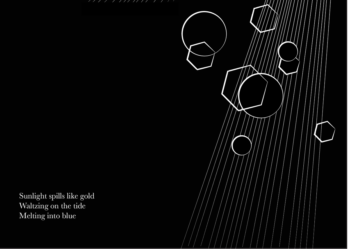
Created a non-literal visual and typographic interpretive sequence inspired by a traditional three-line Japanese haiku poem. The sequence should look cohesive as a unit, but page spreads should look complete in booklet form.
Created a non-literal visual and typographic interpretive sequence inspired by a traditional three-line Japanese haiku poem. The sequence should look cohesive as a unit, but page spreads should look complete in booklet form.
Inspiration & Sketches
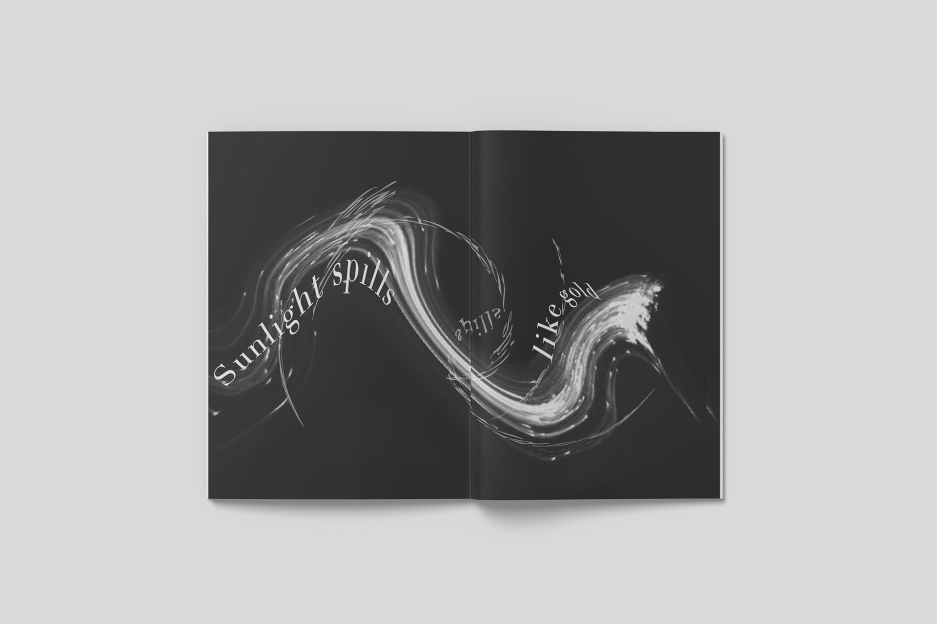
Sunlight spills like gold
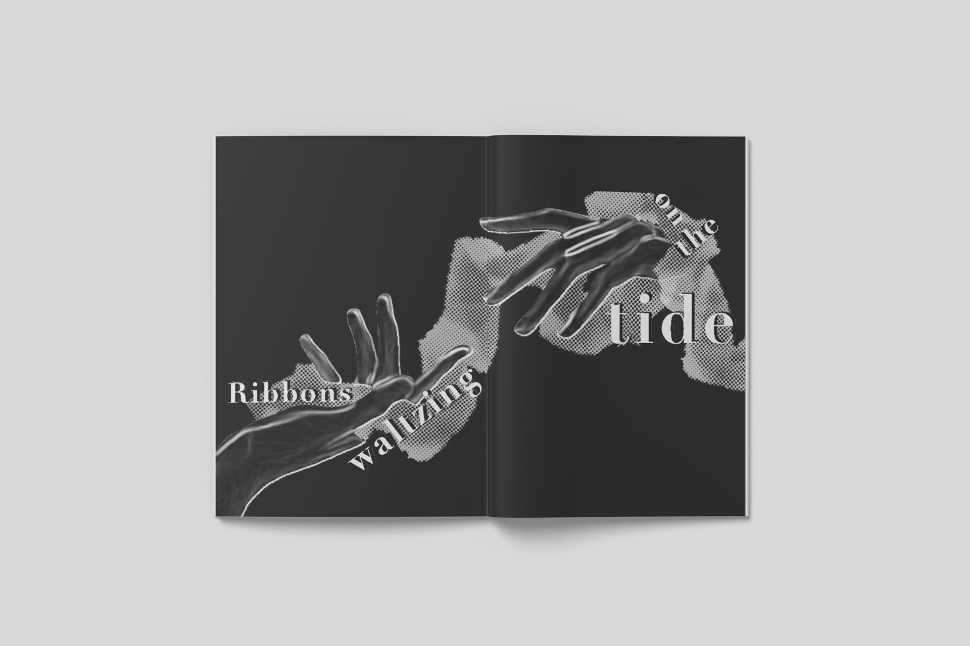
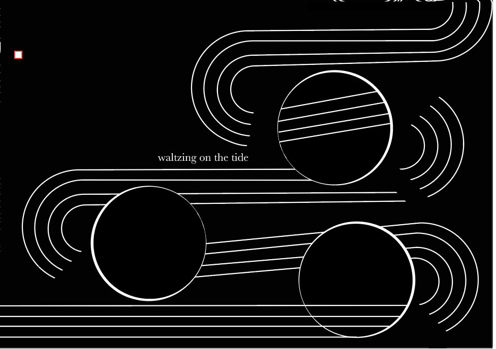
Waltzing on the tide
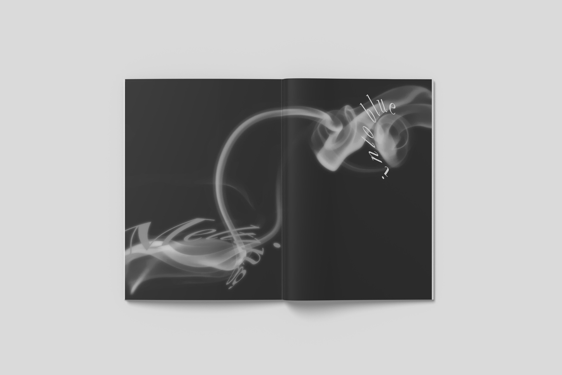
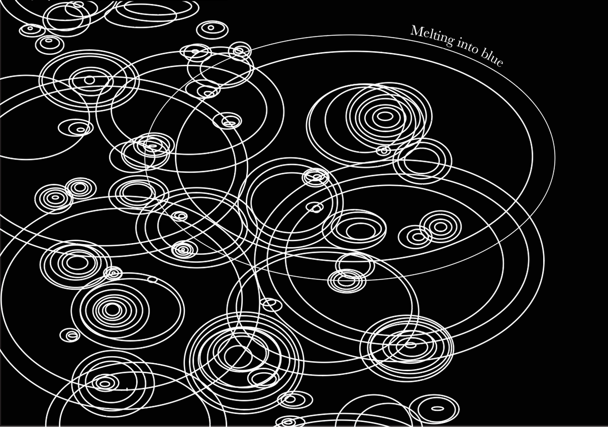
Melting into blue
Sunlight spills like gold
Waltzing on the tide
Melting into blue
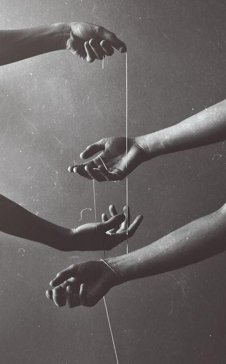
As the project guidelines were to create a nonliteral and interpretive visual sequence, I began by brainstorming abstract and/or symbolic imagery that represent the contents of the haiku. I decided to first explore iterations without images, but rather compositions with line and shape to explore a more conceptual approach. Below are some inspiration images and initial sketches.


Type Studies
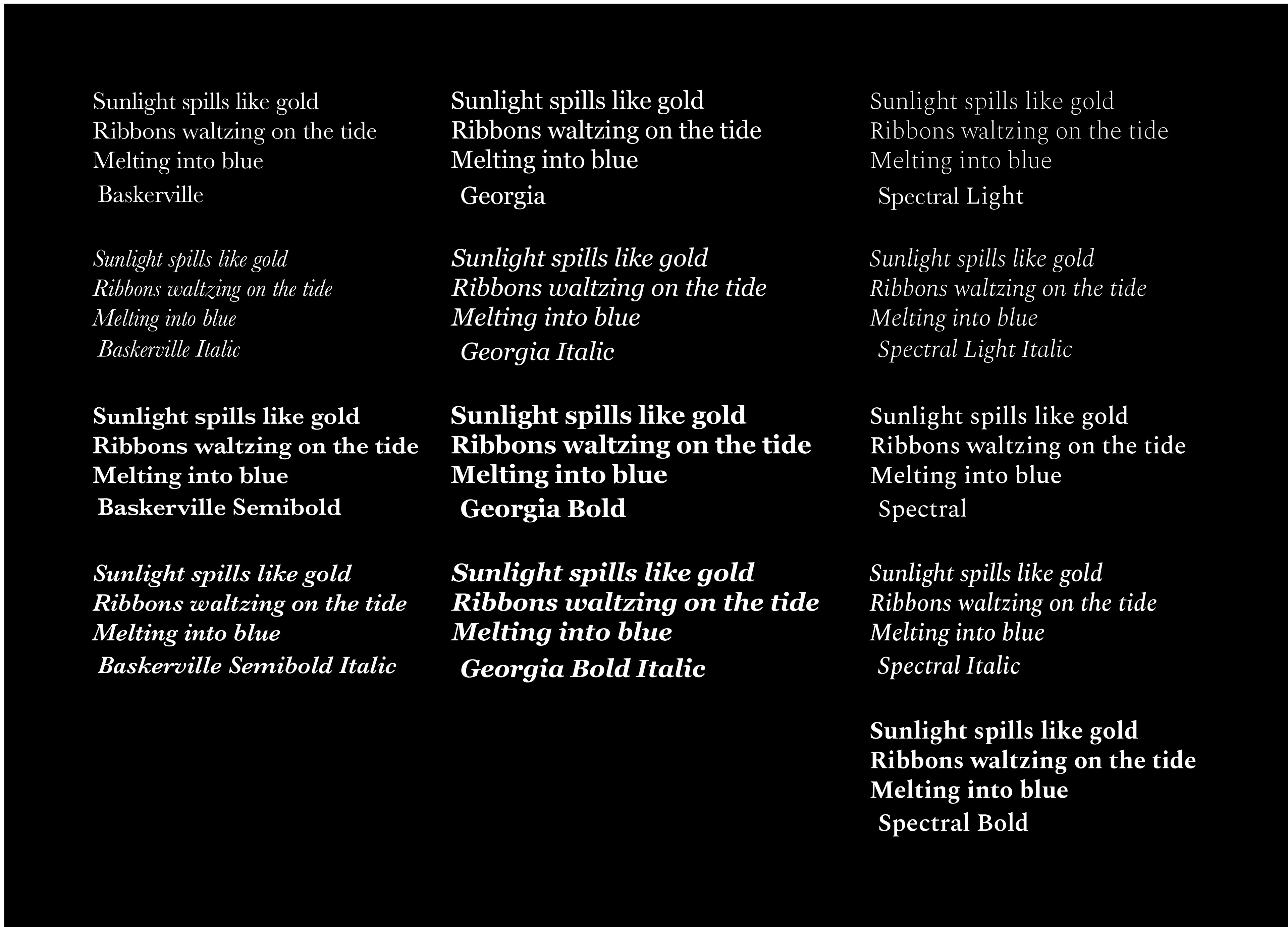
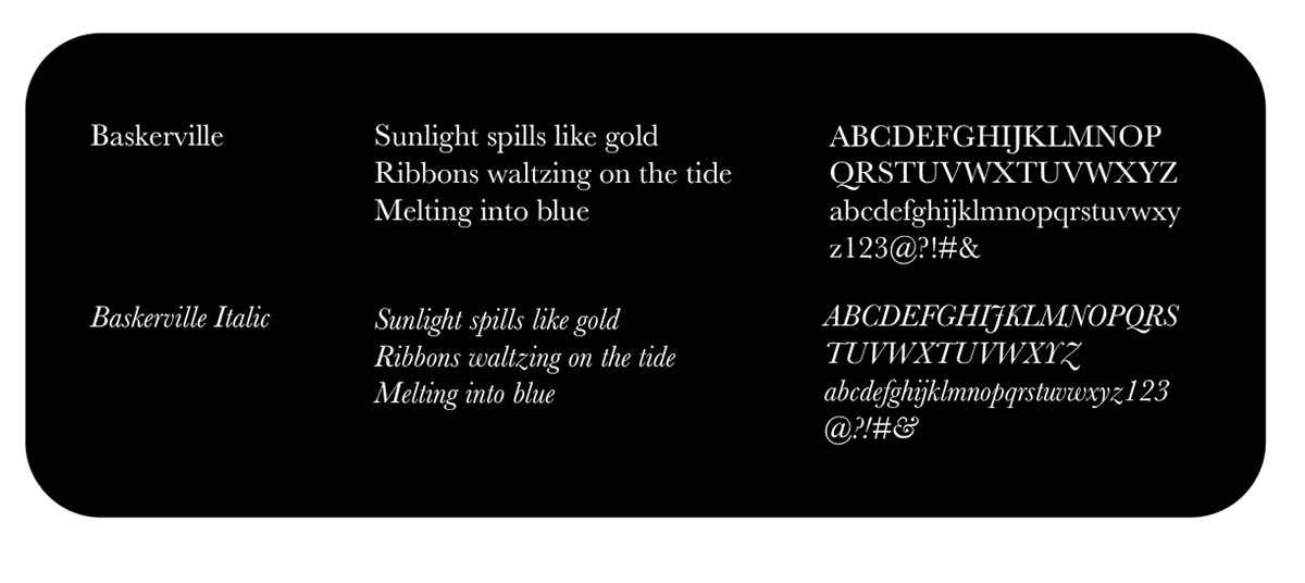
I decided to look at serif typefaces, as they have a classic and traditional feel, similarly to that of the art of haiku poetry. Baskerville being a transitional typeface, it is recognized for its elegance and legibility, both factors I wanted to achieve in my composition.
Digital Iterations
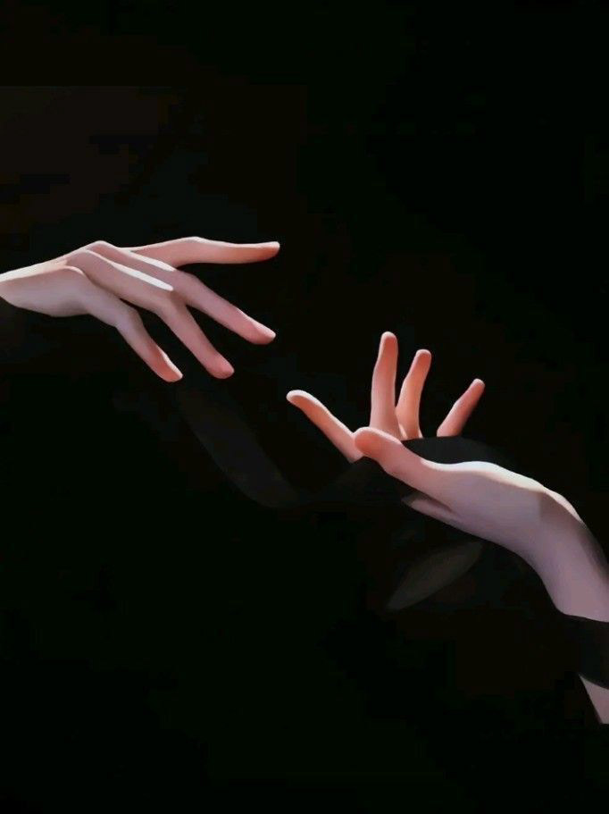
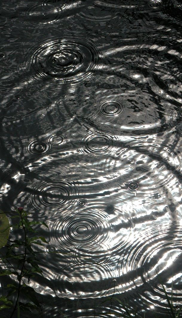
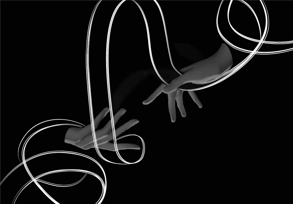
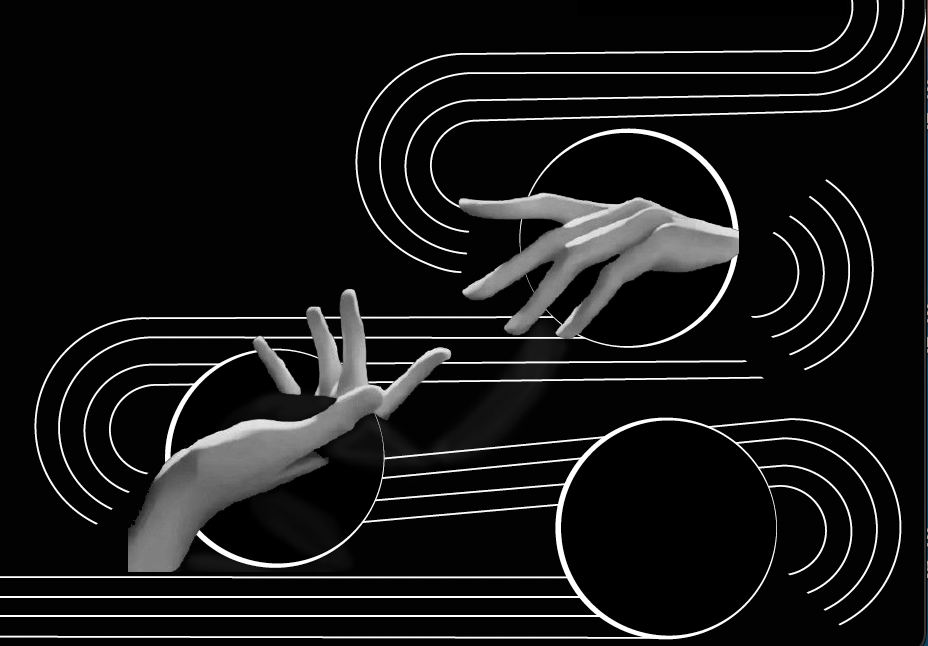
I decided to explore compositions of shape and line, compositions with imagery, as well as integrating the two together. Ultimately I decided to use abstract imagery to support the message of the haiku.
I decided to explore compositions of shape and line, compositions with imagery, as well as integrating the two together. Ultimately I decided to use abstract imagery to support the message of the haiku.
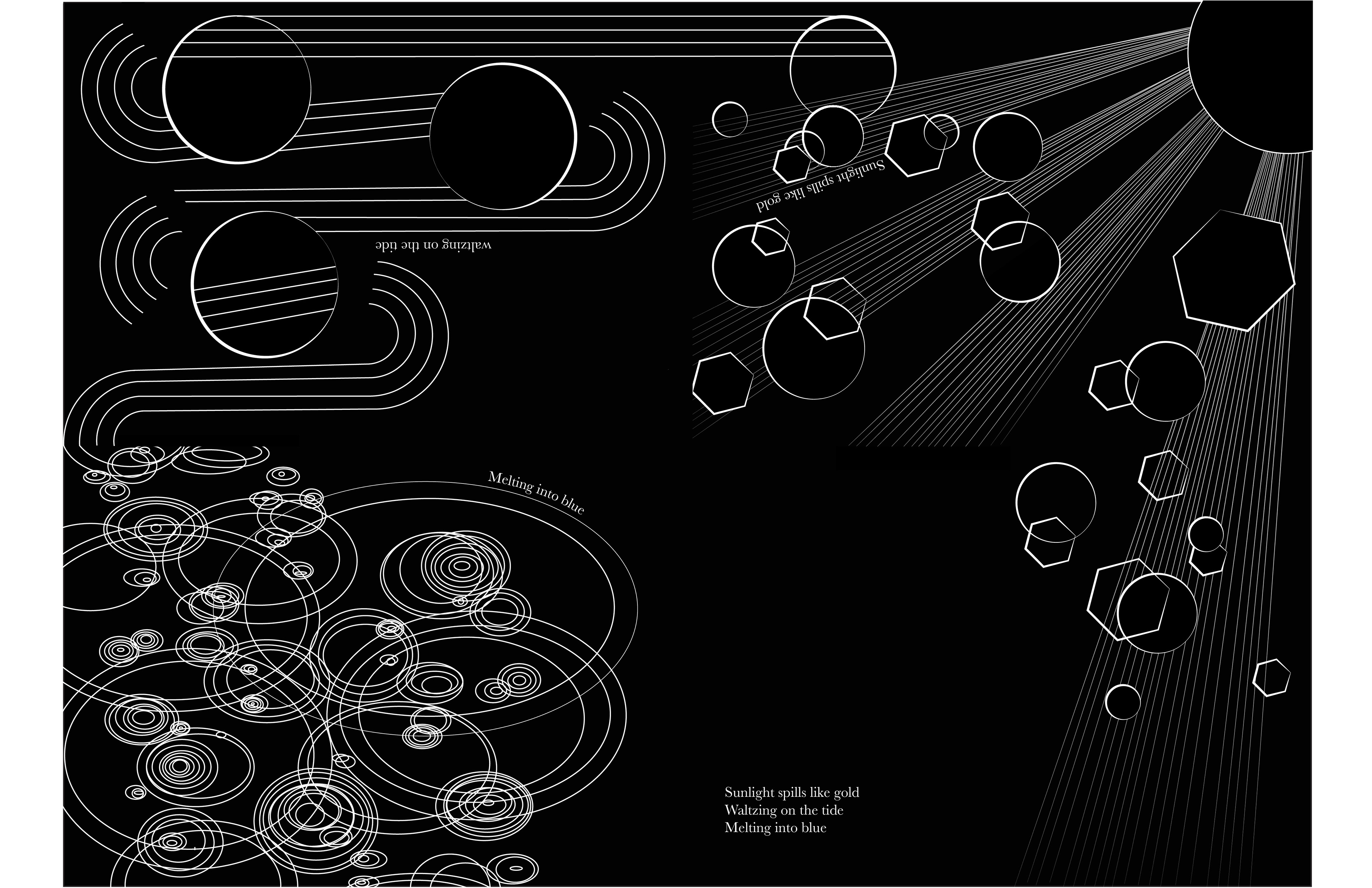
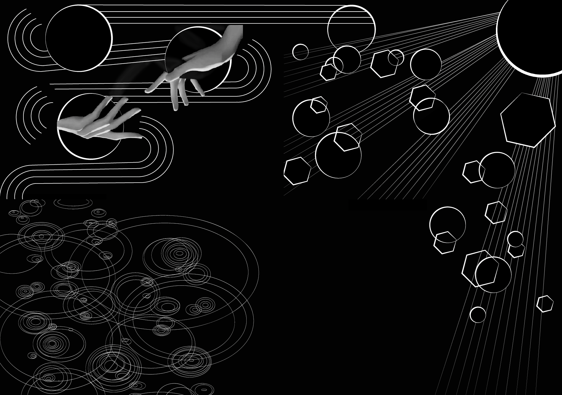
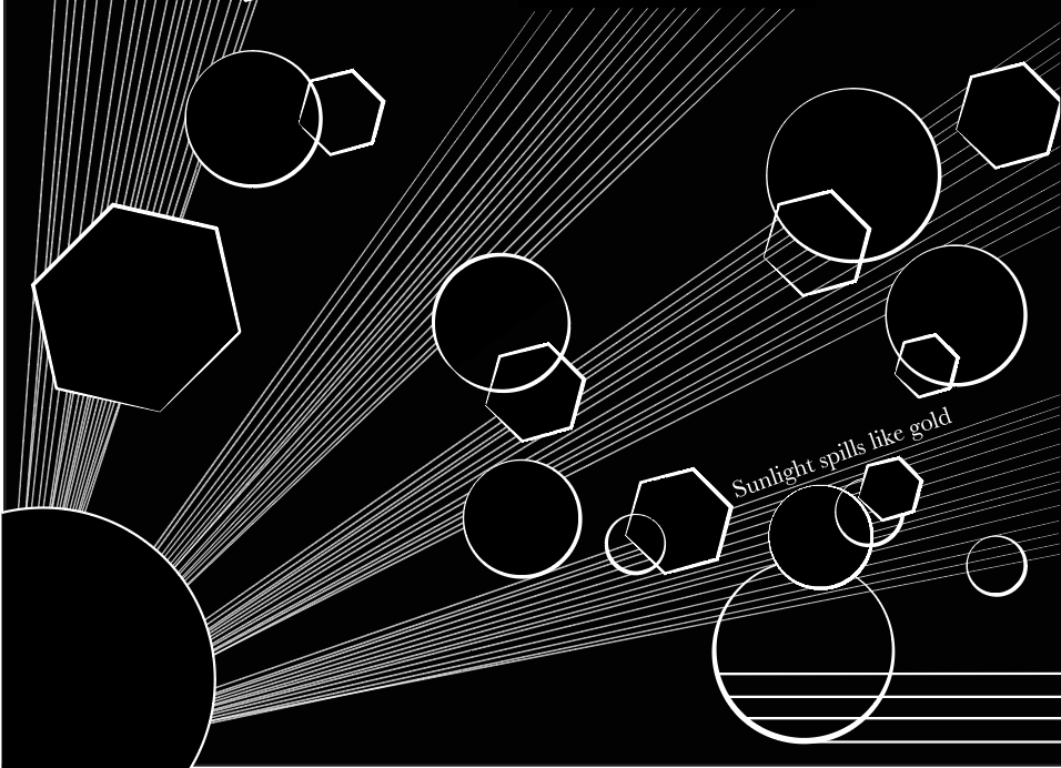
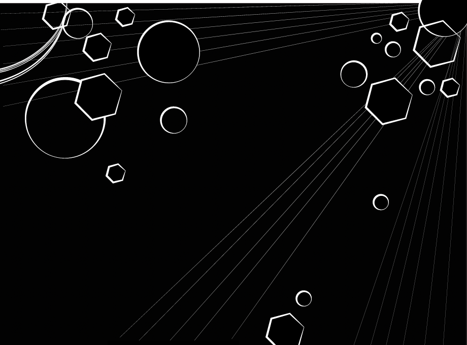
Final design decisions.
I decided to use symbolic imagery to maintain the nonliteral requirement of the project. I also experimented with warping the type enough to remain legible, but abstract it to blend into the visual composition. I used photoshop to manipulate the imagery in a way that they would be highly contrasted from the black background, and to obtain a more graphic approach.
I decided to use symbolic imagery to maintain the nonliteral requirement of the project. I also experimented with warping the type enough to remain legible, but abstract it to blend into the visual composition. I used photoshop to manipulate the imagery in a way that they would be highly contrasted from the black background, and to obtain a more graphic approach.
