
Adobe Illustrator
2025
2025
Objective
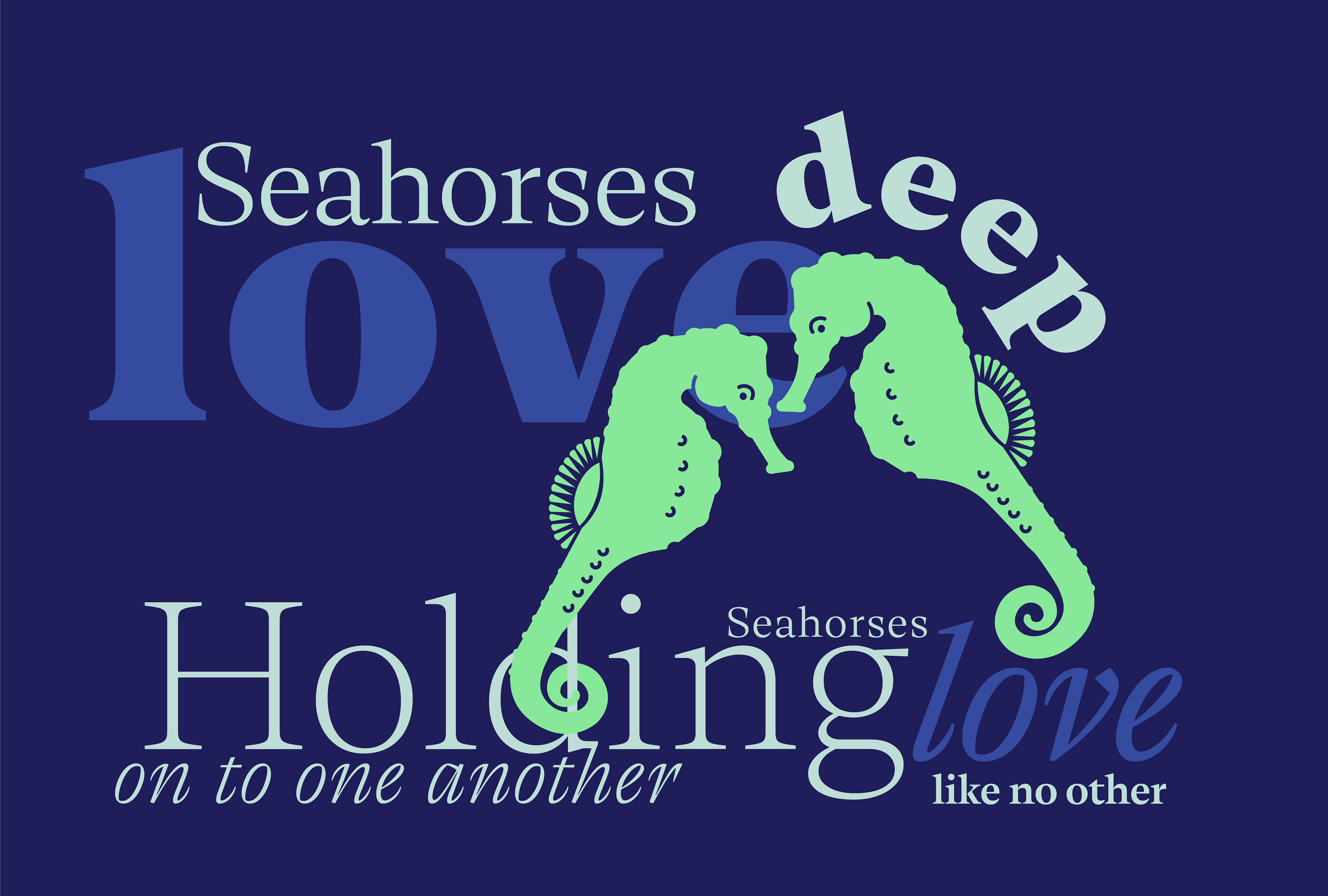
A composition adhering to the Fibonacci sequence. Created a comprehensive visual composition incorporating type and form.
references & research
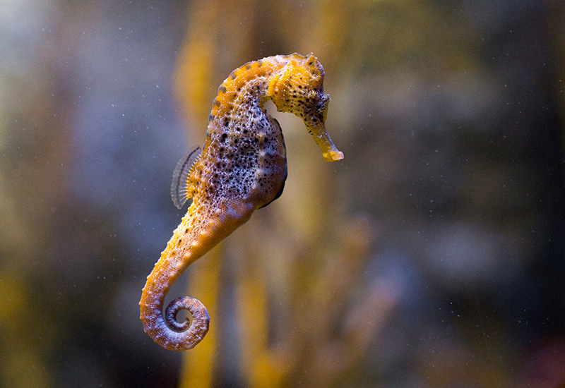
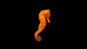
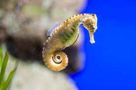
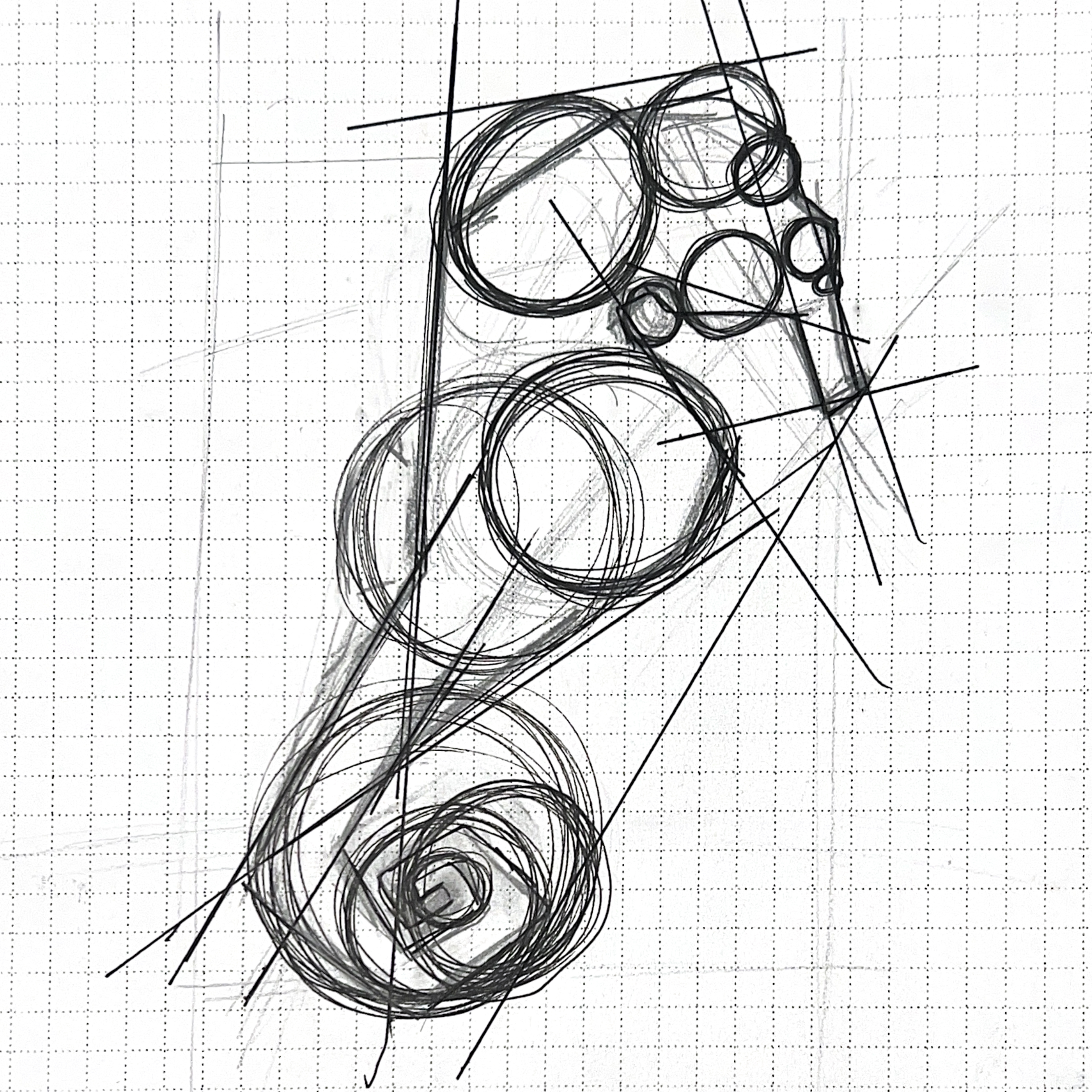
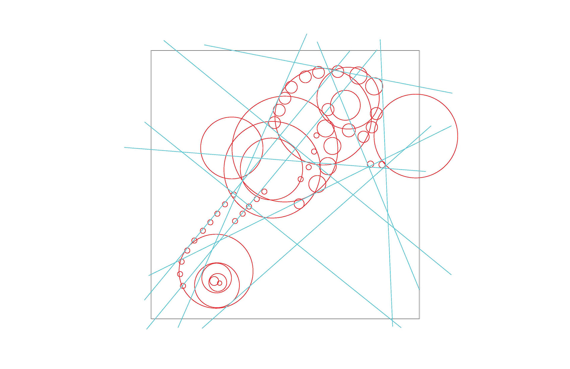
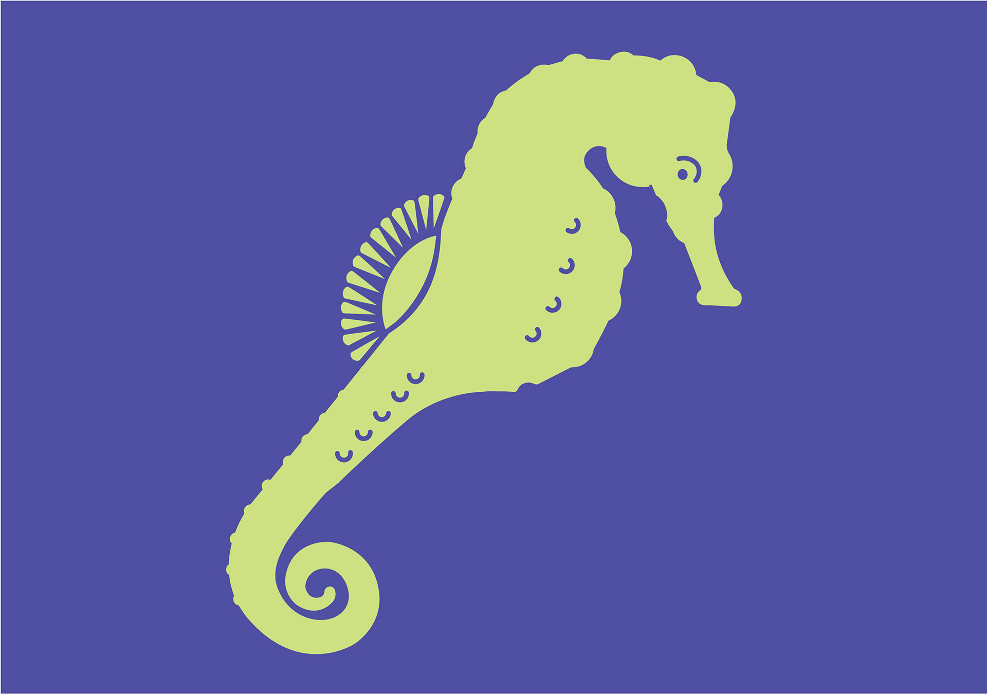
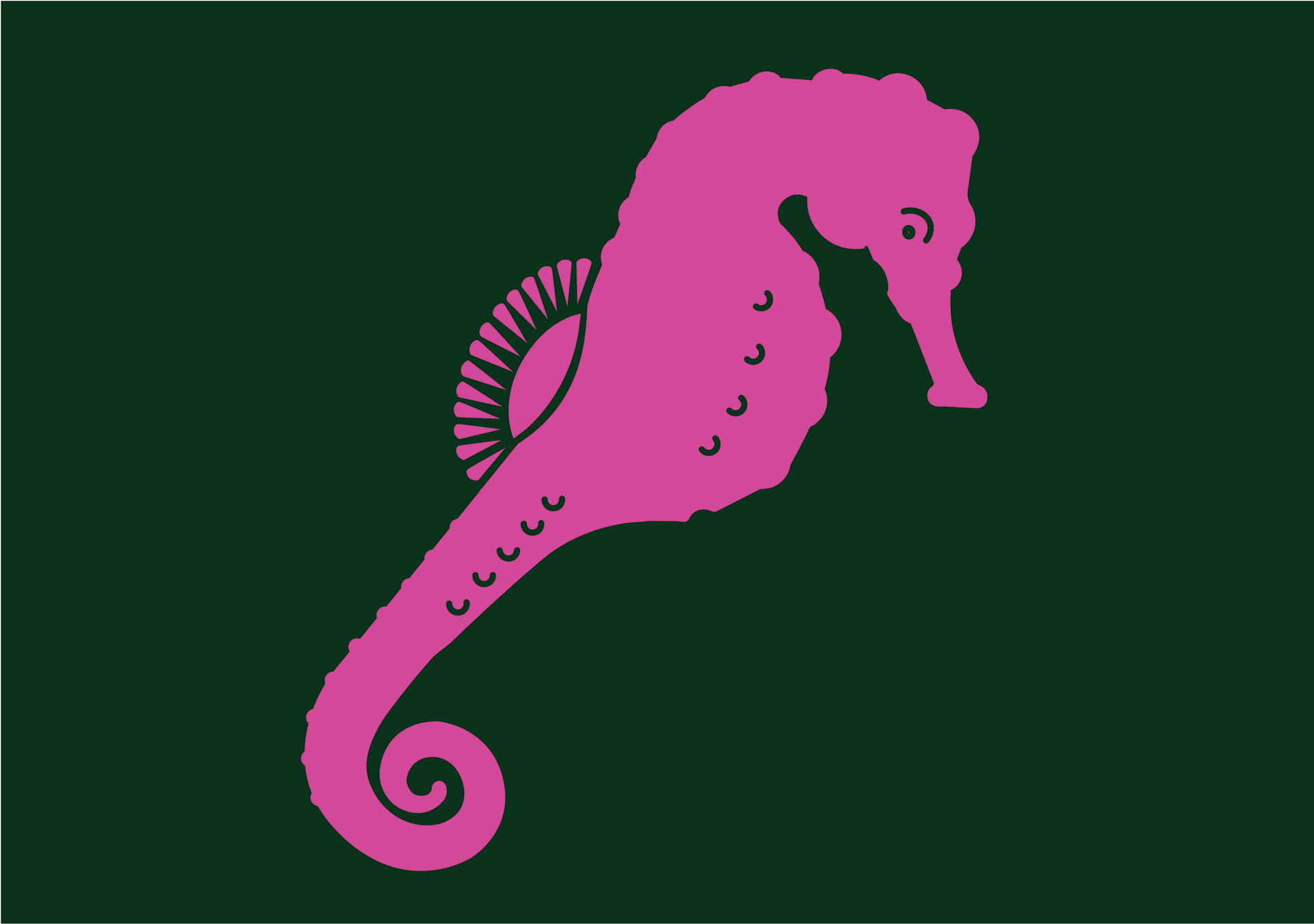
We were first instructed to choose an animal to base our creature mark off of. I chose a seahorse because I find their silhouette to be visually interesting, and I would be lying if I didn't say that I just find them to be cute. As we were using construction lines and ellipses to create the shape of the creature mark, I also say a lot of potential in the curves of their body, specifically their tales and dorsal fins.
Phase 1: Form analysis
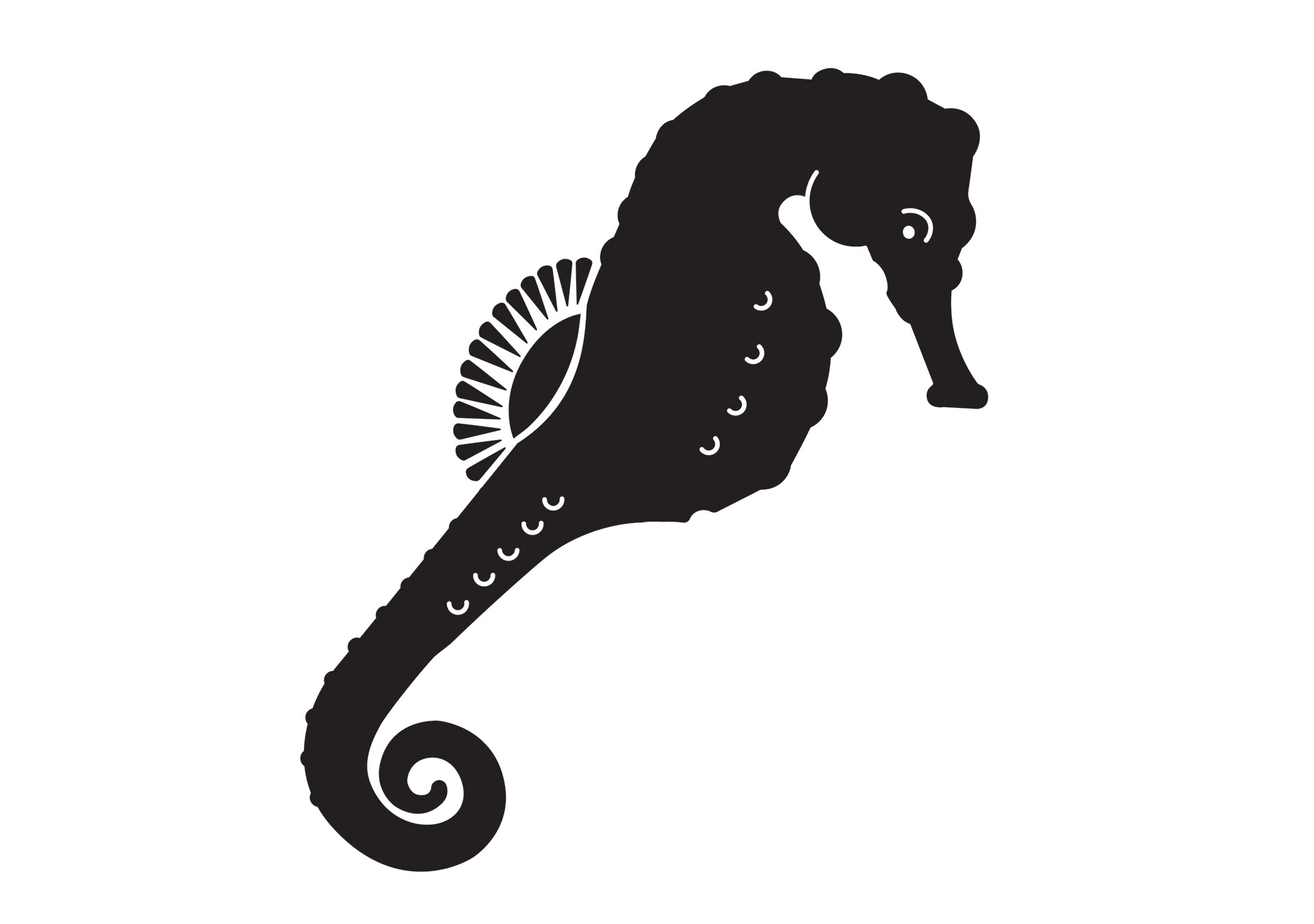
Digital creature mark in back and white.
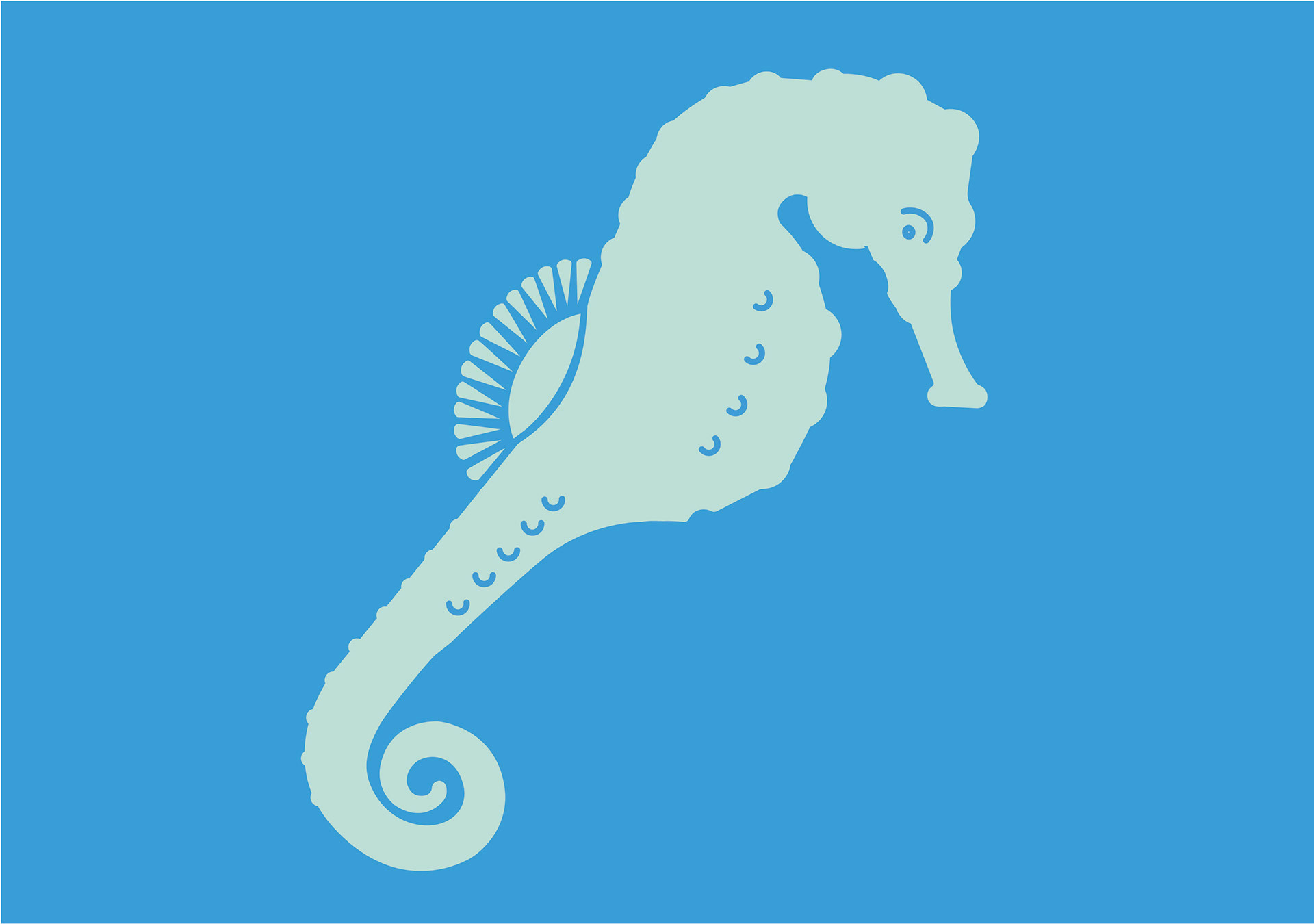
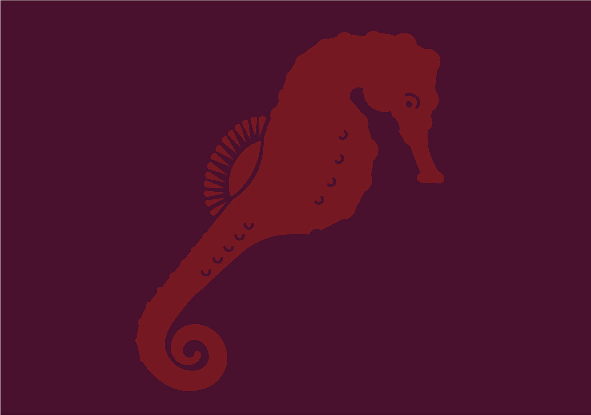
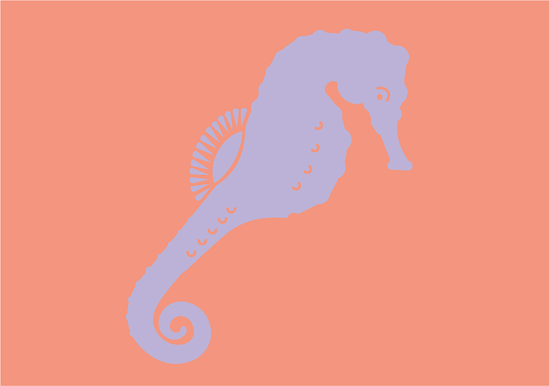
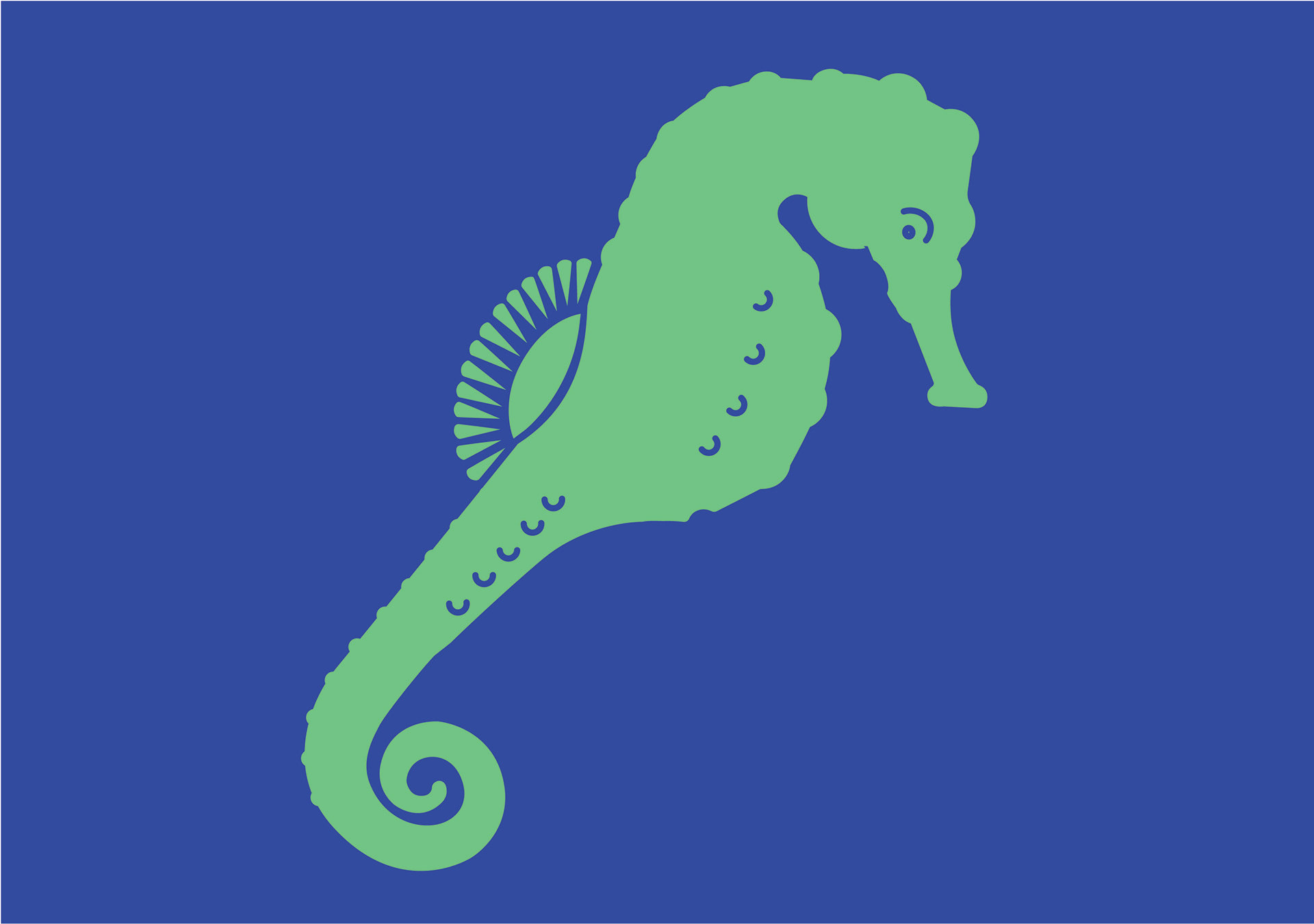
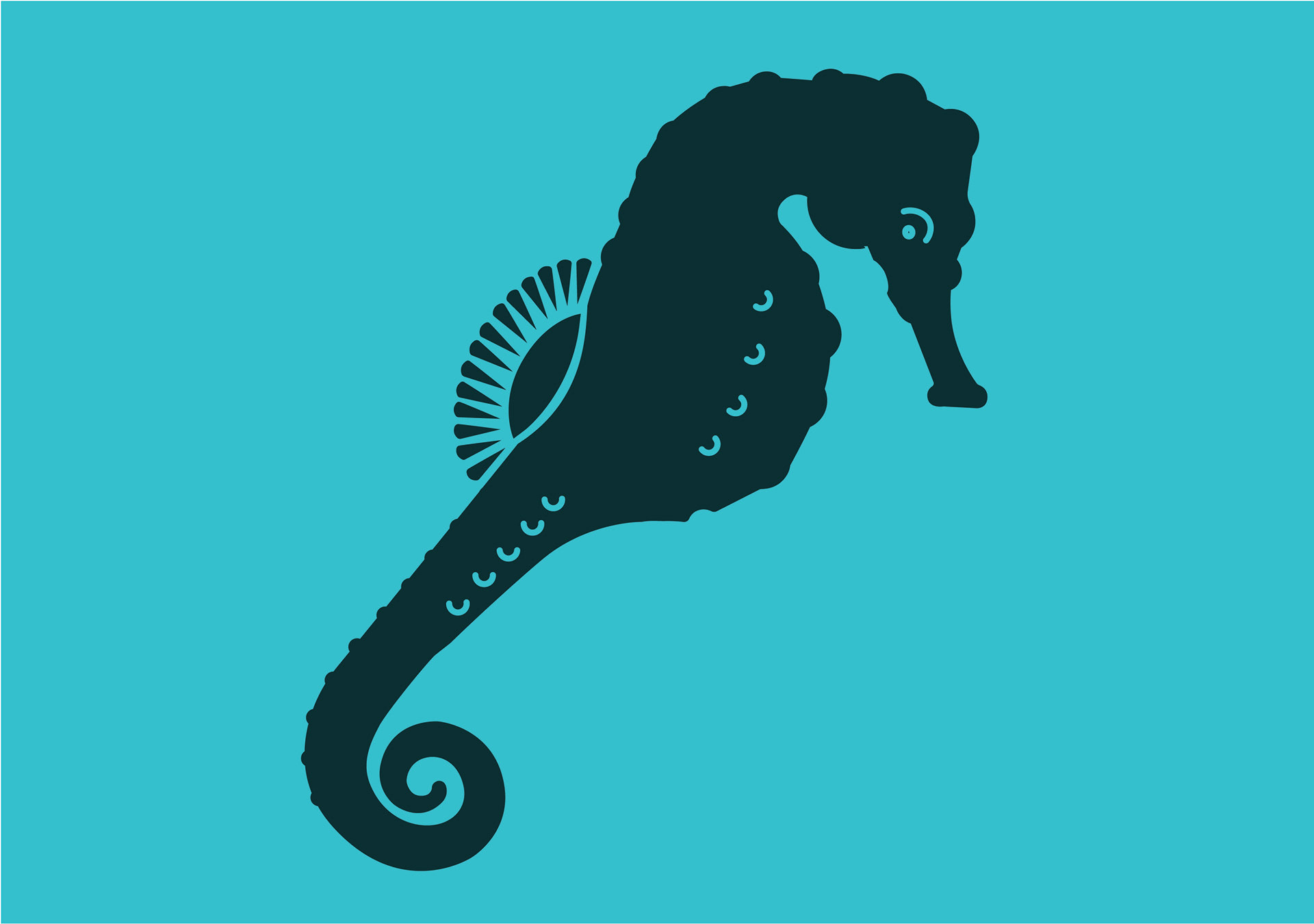
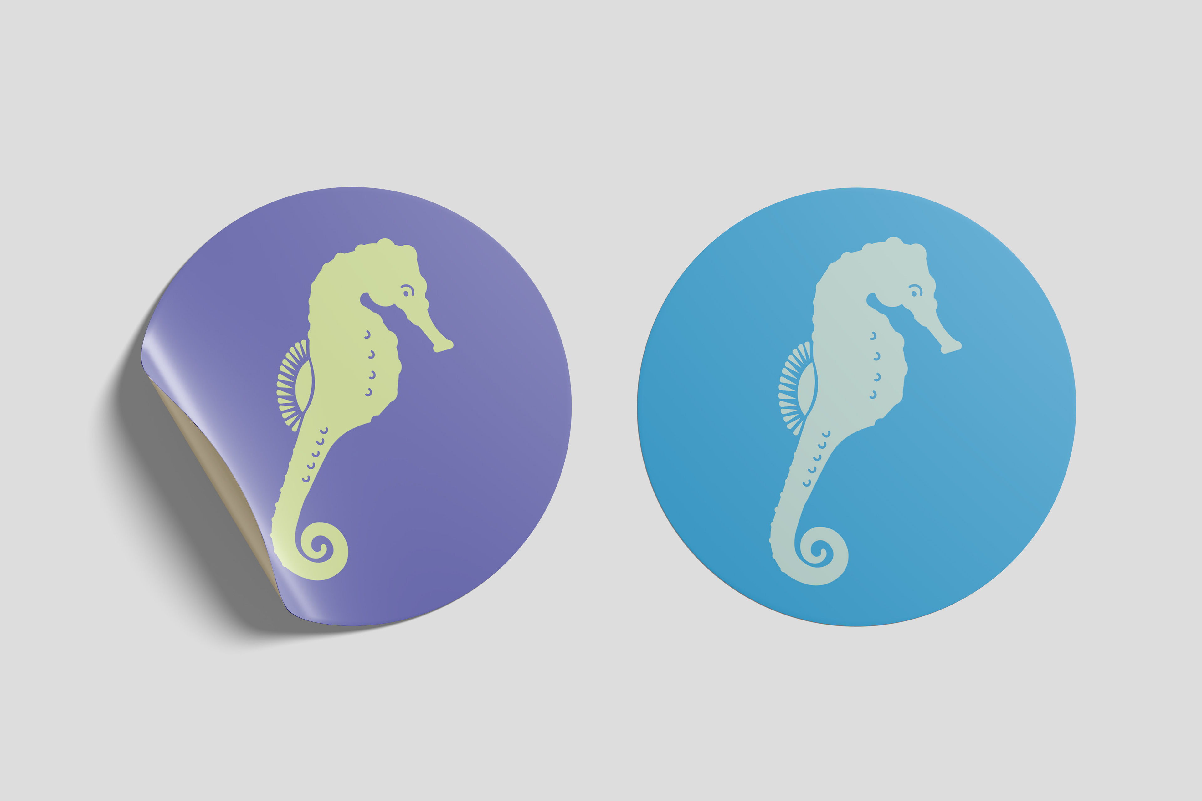
Color exporations.
Phase 2: Haiku
Seahorses love deep
Holding on to one another
Seahorses love like no other
Holding on to one another
Seahorses love like no other
In my research, I discovered a unique attribute of seahorses is their mating patterns. They are monogamous creatures that mate for life. Some species even perform a routine dance with their mate before parting ways for the day. I found this sentiment to be remarkably romantic, which inspired my approach in the composition. Seahorses' special ability to love and dancing ritual was the inspiration behind the decision to incorporate two creature marks into the layout, as opposed to just one.
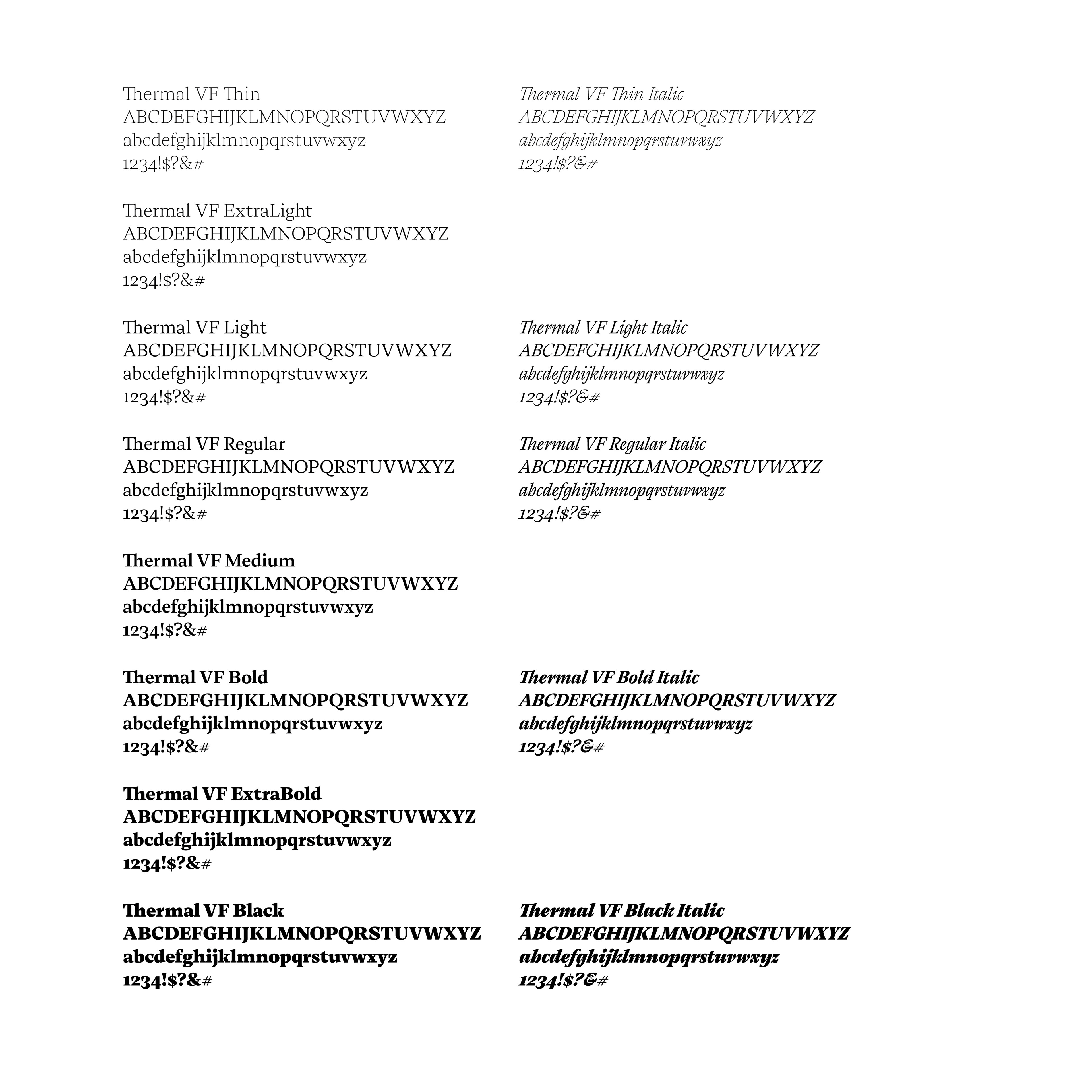
I wanted a superfamily as my typeface choice, as I wanted to explore using different weights and fonts into the haiku. In my type research and studies, I came across a variable typeface, Thermal VF. I appreciated the contrast and open counter space, and chose it mostly for its serifs and double story lowercase g. Because I wanted to communicate a special romantic affinity between the two creatures, I thought a serif typeface would be the most appropriate.

In the project requirements, we were to base our composition off of the Fibonacci spiral. This constraint took some trouble shooting during the layout of the haiku. The problem I had to consider the most was saying out the type in a way that could be logically grouped into lines, so it didn't affect the way the haiku was read, while also adhering to the sequence pattern. In most of my early compositions, I set the word 'love' to be a highly saturated red in attempt to communicate the feeling of passion and love. After feedback from my professor, I decided the scale of the word in itself was enough distinction and chose to abandon the idea to limit distractibility.
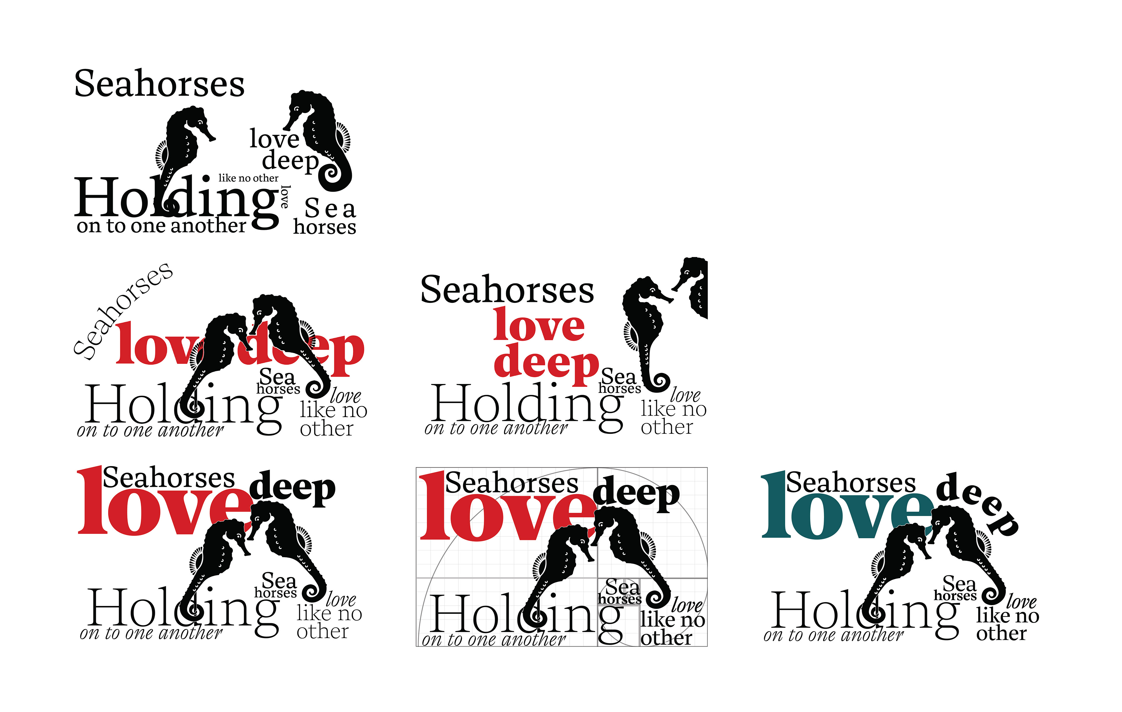
Final design decisions.
I went with a cool tone color palette with high contrast and set the words in varying weights and fonts to create visual interest.
I went with a cool tone color palette with high contrast and set the words in varying weights and fonts to create visual interest.